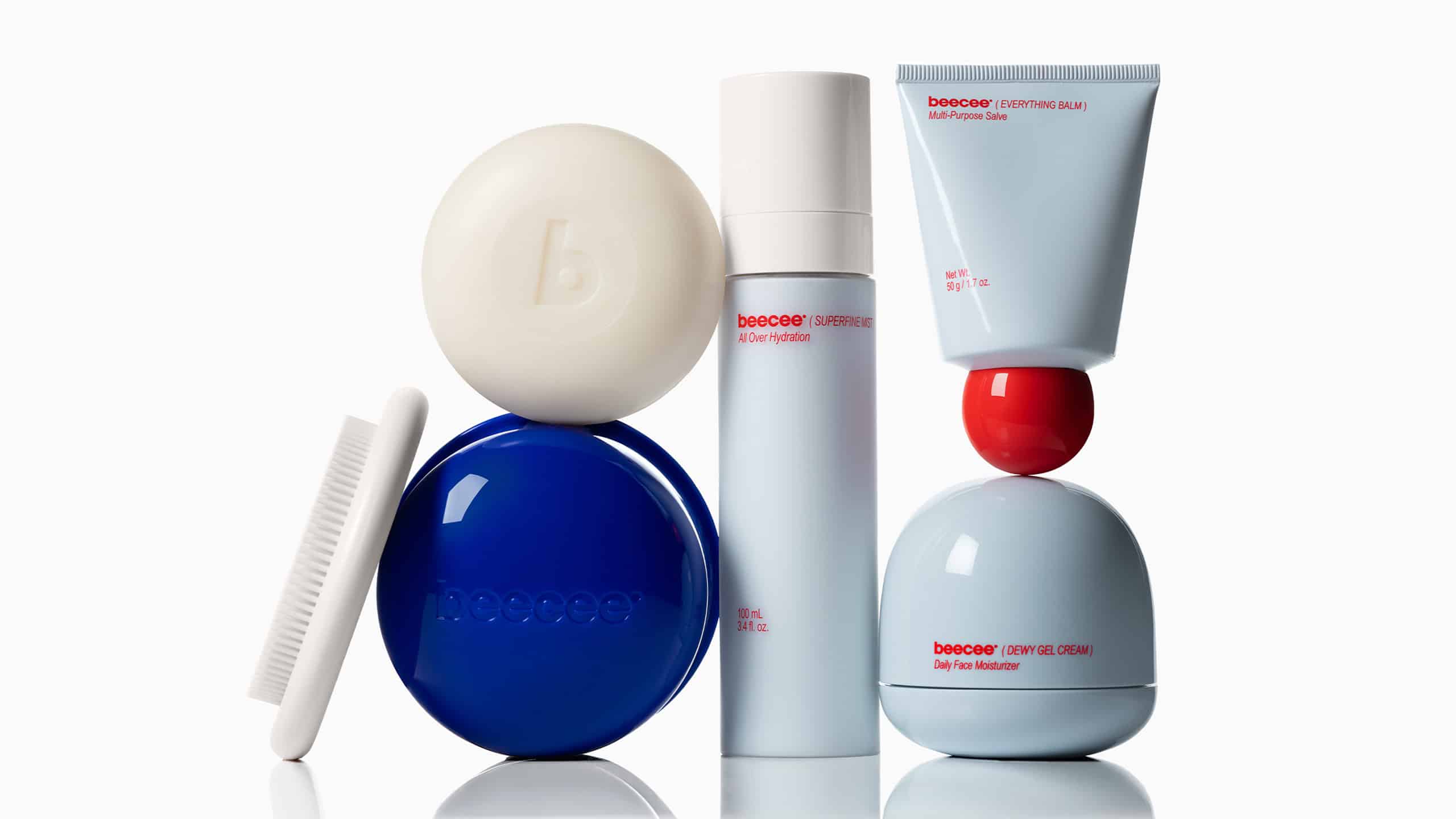
Established Gives Beecee a Bold New Voice in Clean Skincare
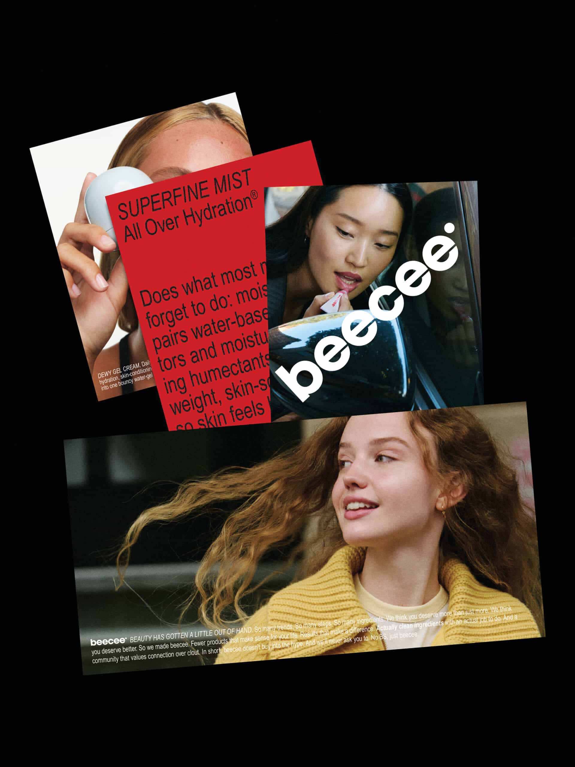
For Beecee, Established translated longstanding clean beauty expertise into a confident, colourful identity designed for a younger audience. Created for the agency’s long-term client Gregg Renfrew, the skincare brand speaks to consumers who know what they want—and are increasingly sceptical of the marketing promises that surround beauty products.
Having recently designed Counter, the parent line, Established was tasked with bringing that same clean beauty know-how to a new generation. The challenge was to communicate the integrity behind the formulas through a brand that felt approachable, distinctive and aligned with its audience’s willingness to question convention.
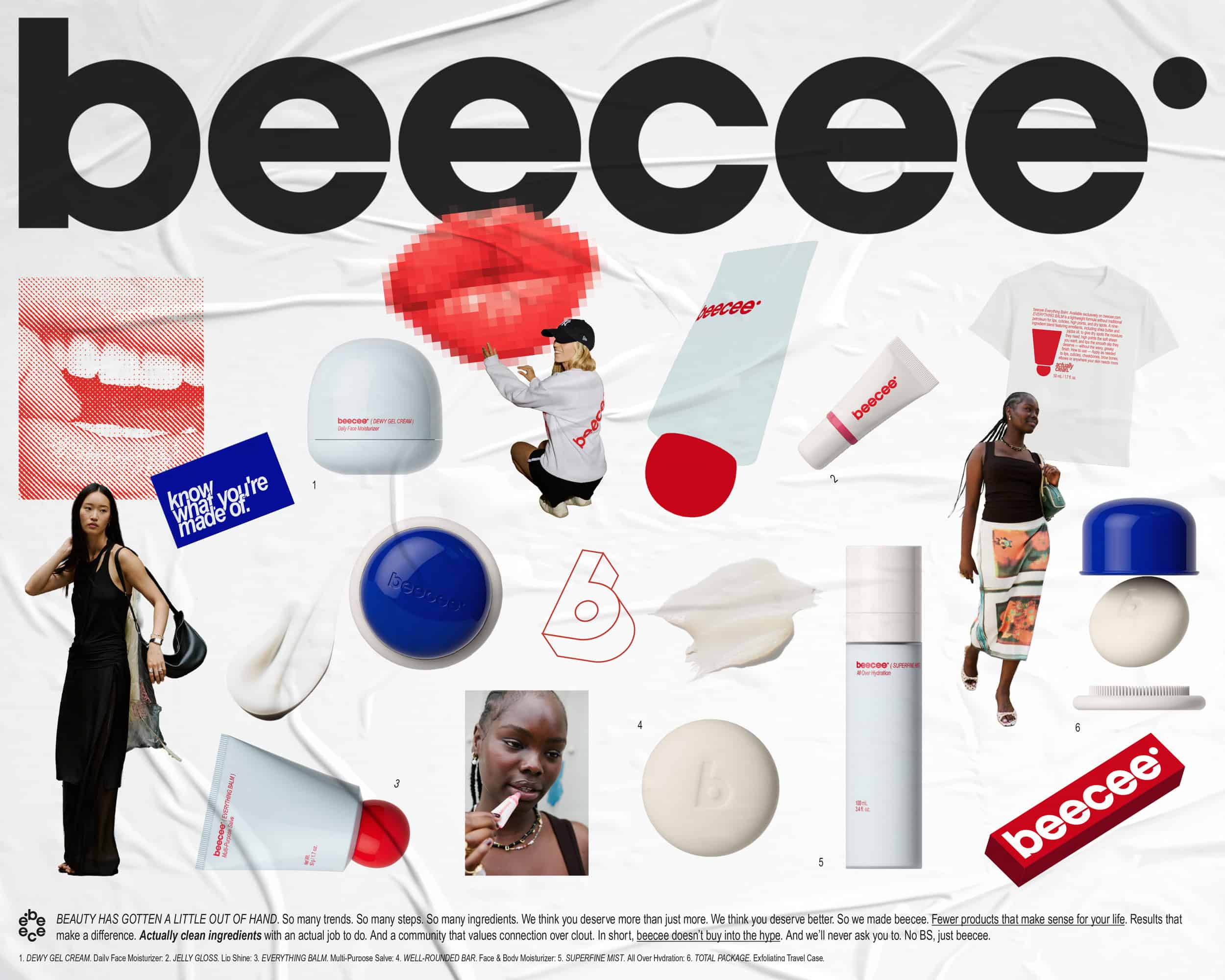
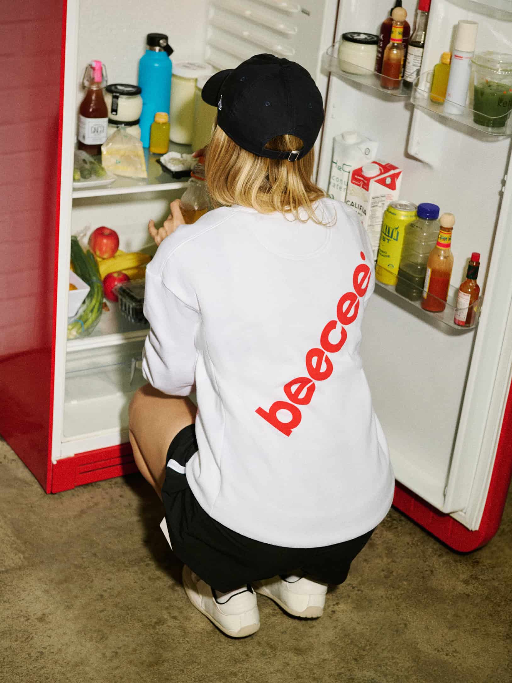
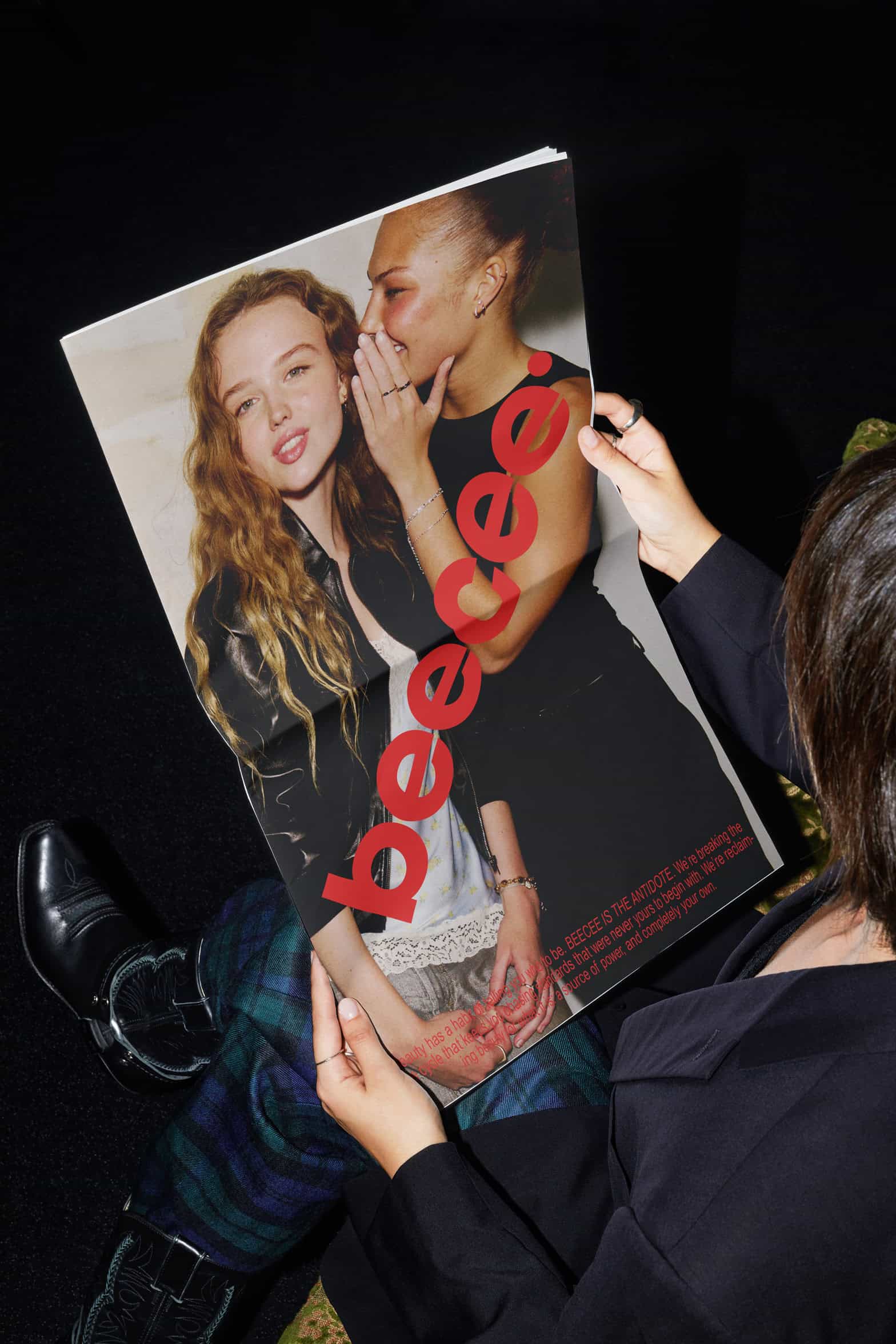
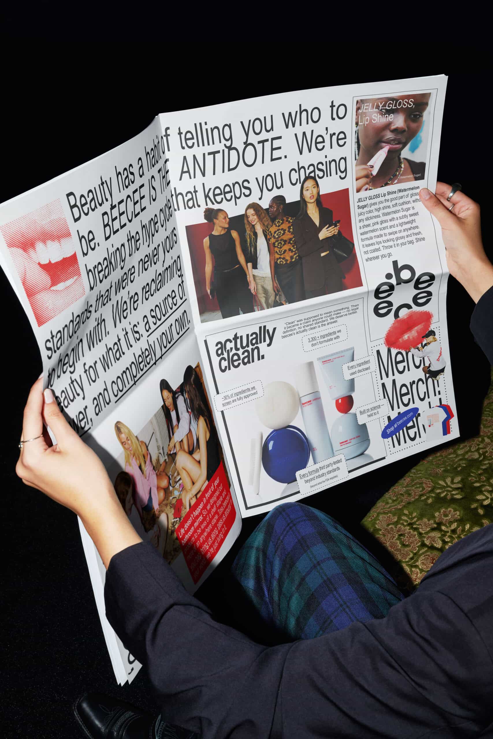
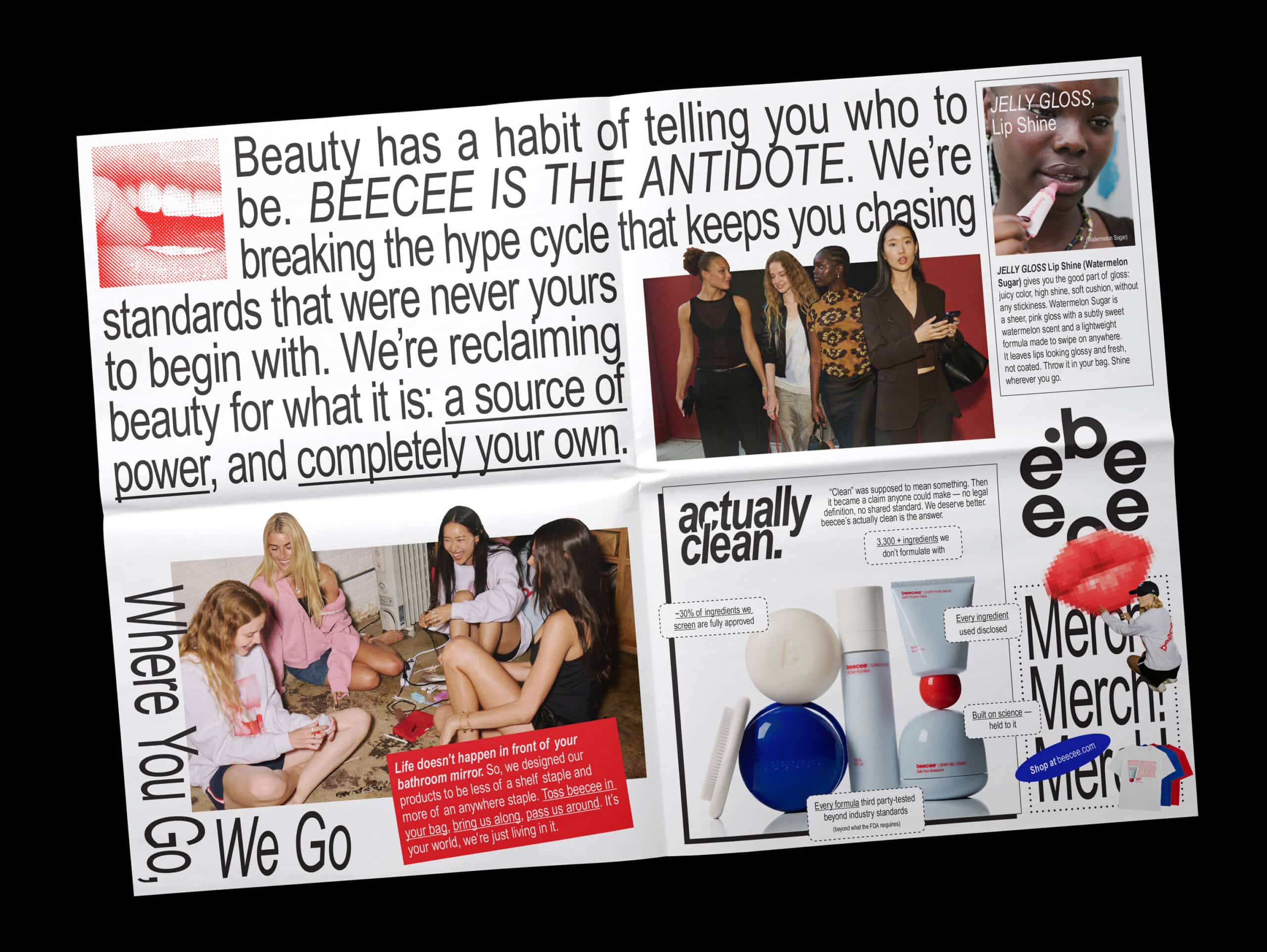
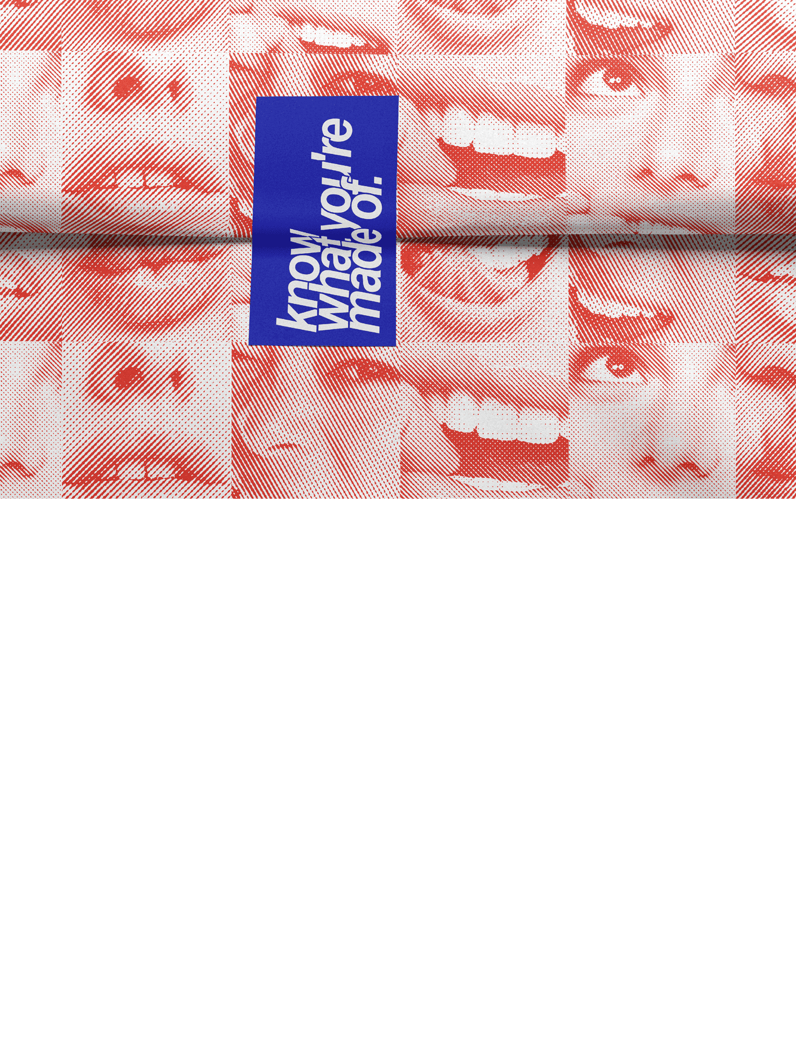
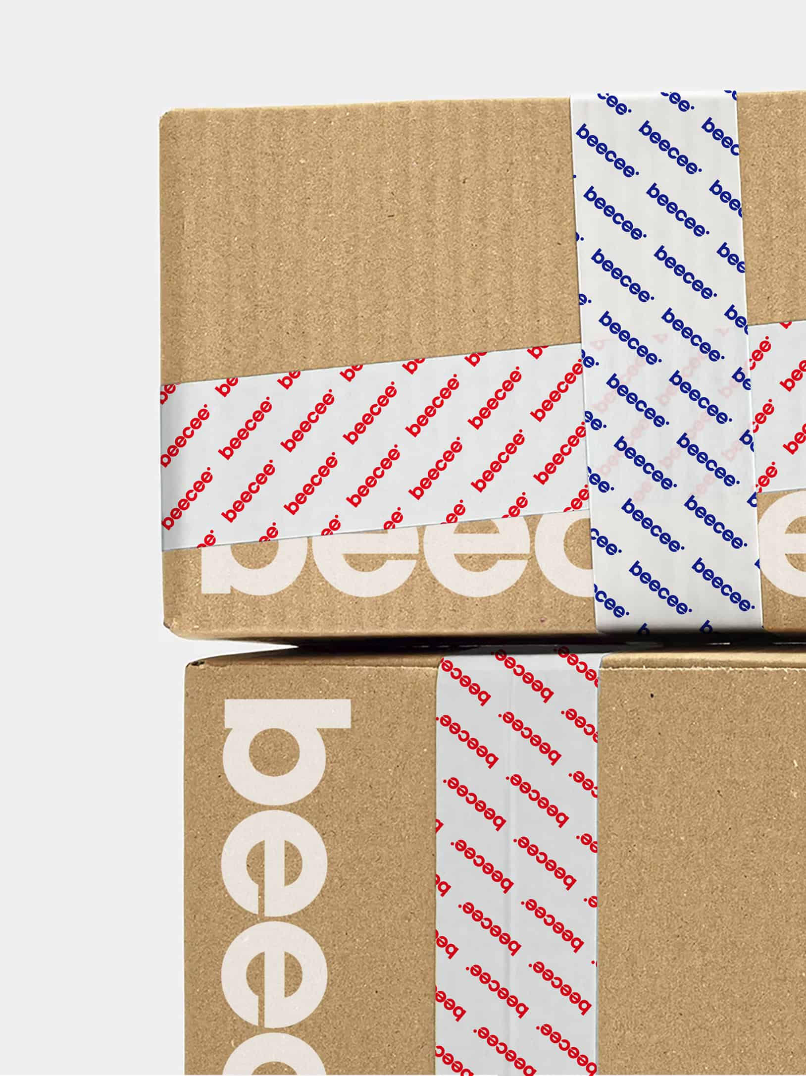
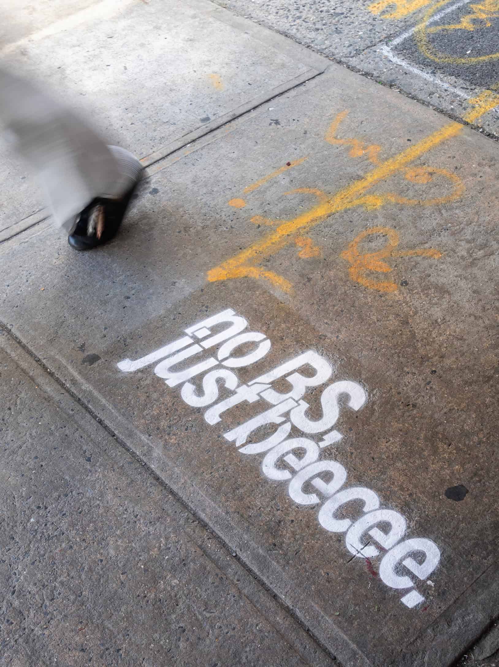
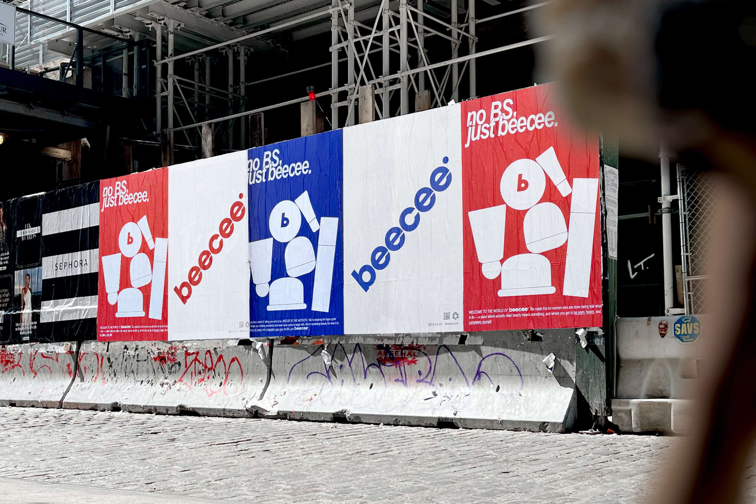
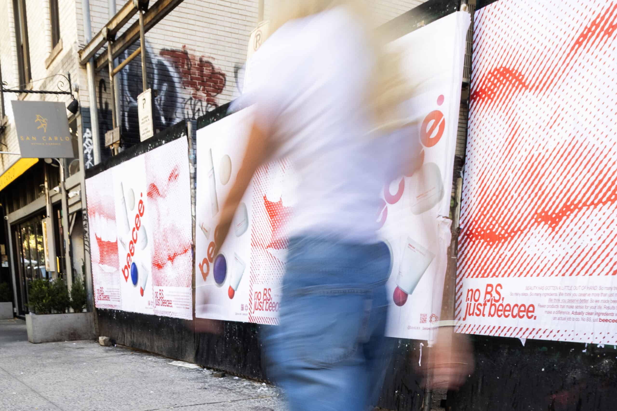
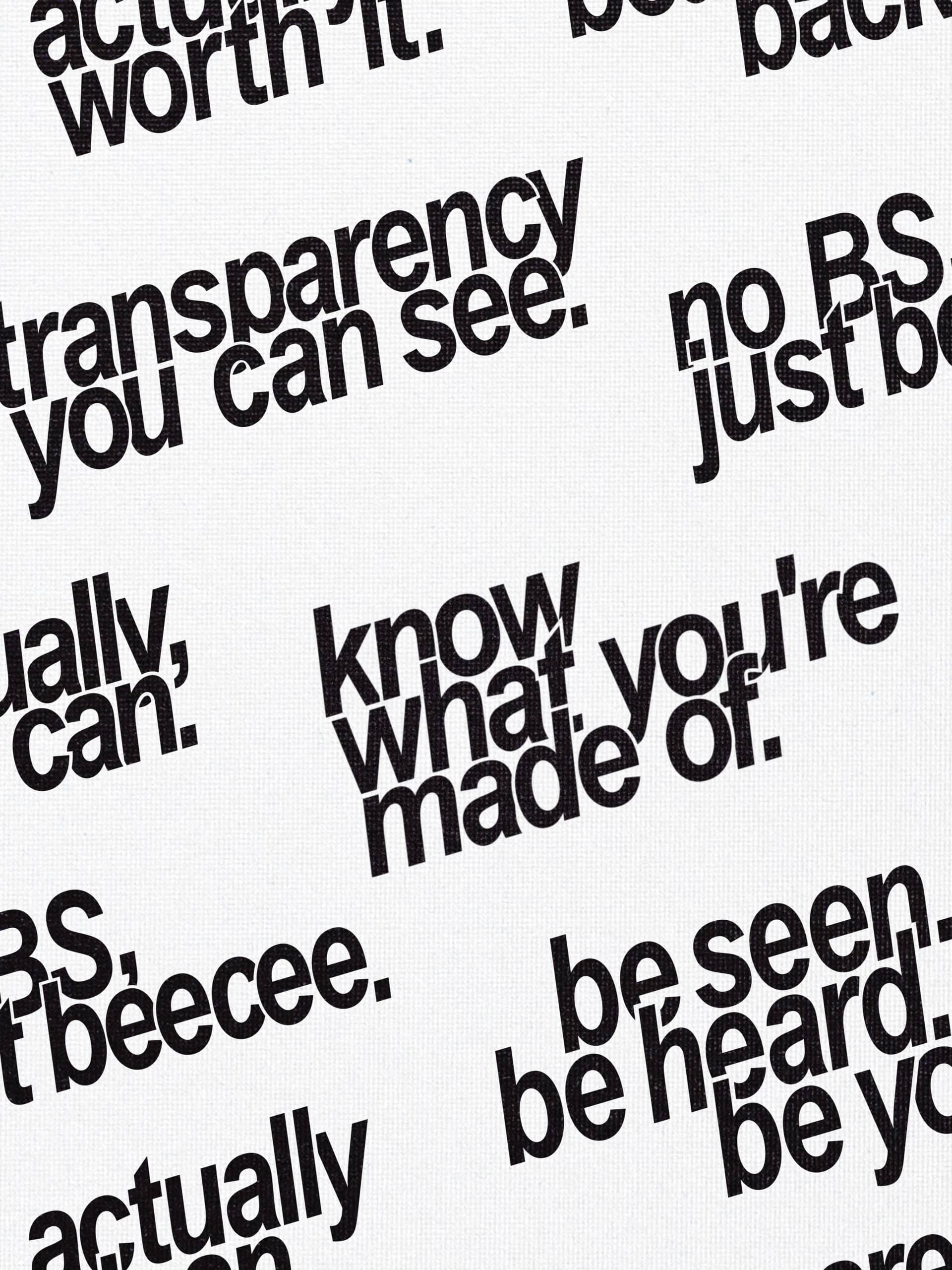
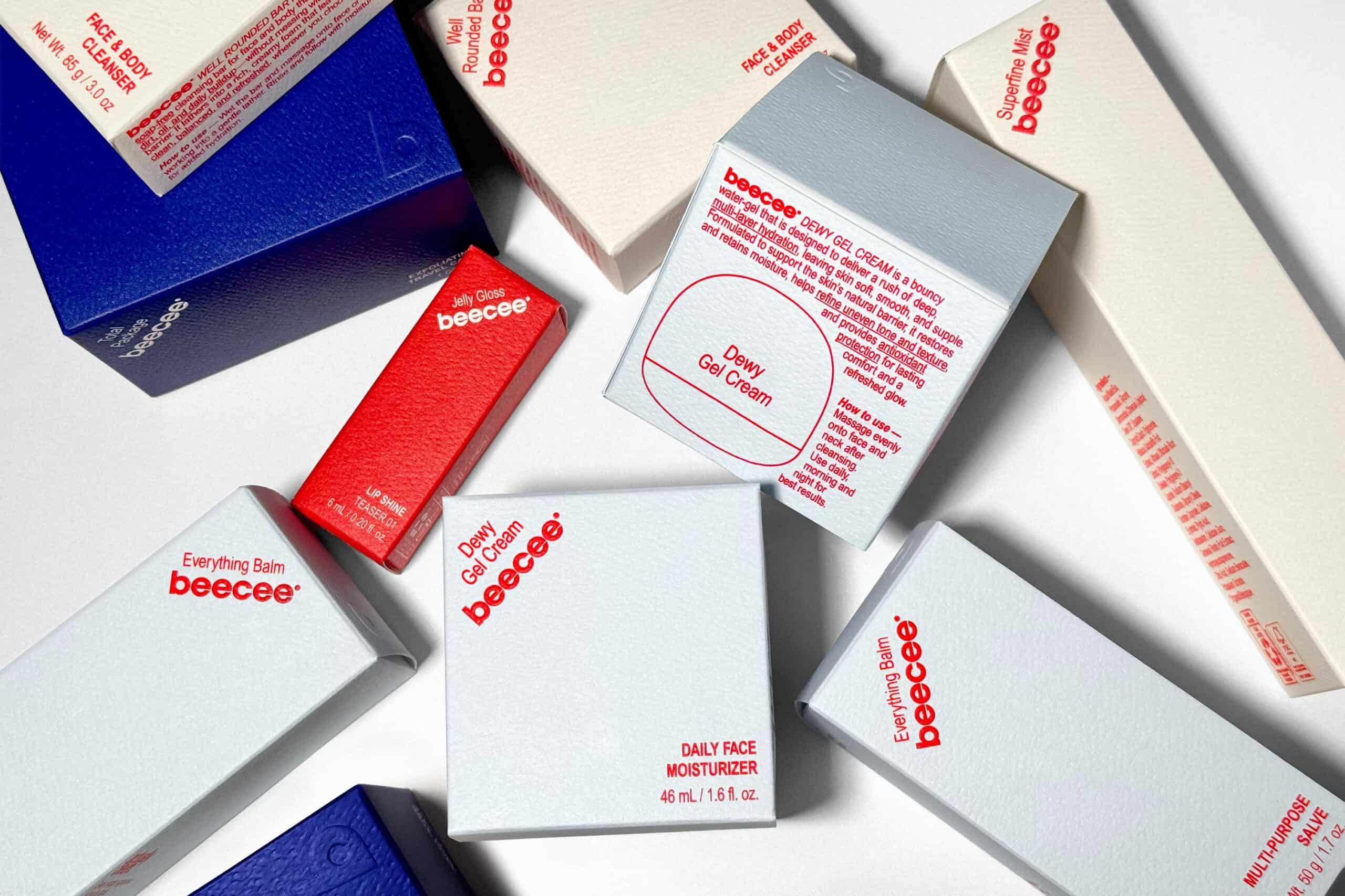
Established responded with branding and packaging built around a bold primary colour palette. Loud, playful and immediately recognisable, the design reflects the confidence of a consumer prepared to break from the norm. Rather than relying on familiar beauty codes to signal credibility, Beecee adopts a direct visual language with a strong sense of personality.
The team drew inspiration from the bold colours and simple shapes of general store products. That reference gives the packaging an everyday familiarity, placing skincare within a visual world of practical, accessible objects. Typography and illustrations reminiscent of instruction manuals introduce a functional counterpoint to the expressive palette, balancing energy with clarity.
Together, these elements create an identity that approaches clean skincare with both confidence and humour. Colour attracts attention, while the graphic language suggests usefulness and straightforward communication. The result supports Beecee’s ambition to connect with an audience seeking formulas with real integrity and a brand voice that respects their judgement.
Founded in 2007 by Sam O’Donahue and Rebecca Jones, Established is a full-service creative agency working across strategy, branding, packaging, identity, website design, motion graphics, naming and art direction. With Beecee, the agency demonstrates how a change in visual language can bring established expertise to a younger audience, giving clean skincare a fresh and assertive presence.