Keep Care Flowing: Red Antler’s Brand Identity for Rovex
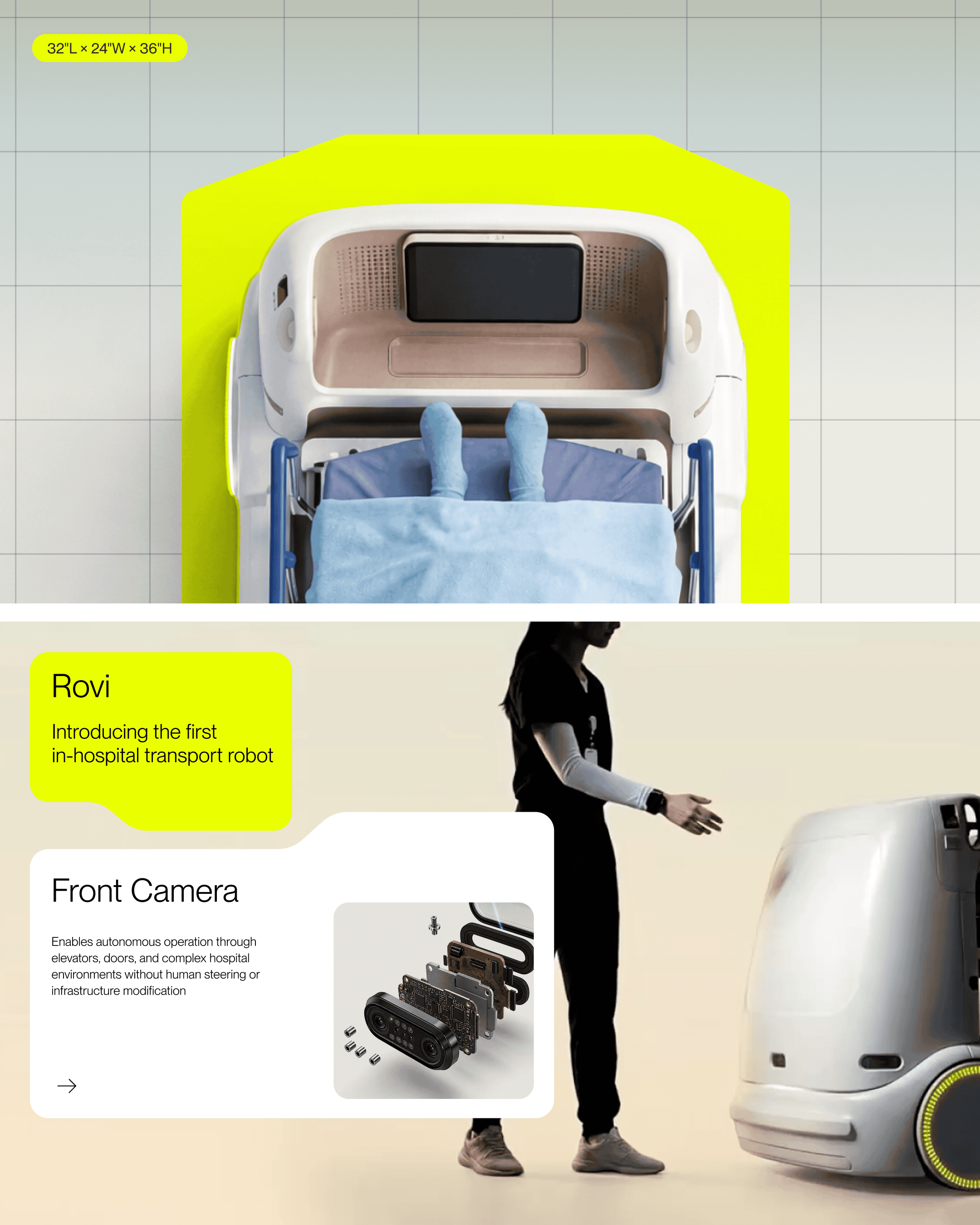
Moving patients through a hospital is a familiar task with consequences that reach far beyond logistics. Delays can affect care, stretch staff capacity, and shape the patient experience. Rovex approached this challenge with Rovi, a robot designed to attach to any hospital stretcher and transport stable patients independently, without requiring changes to the hospital’s infrastructure. Red Antler developed a brand that could introduce this unfamiliar technology to an audience for whom trust is essential.
The challenge was to make Rovi’s capabilities understandable and reassuring within a cautious healthcare environment. Patient transport has traditionally depended on people, so introducing an autonomous robot meant addressing more than its practical benefits. The identity needed to establish confidence in a new way of working while connecting it to the priorities hospitals already understood.
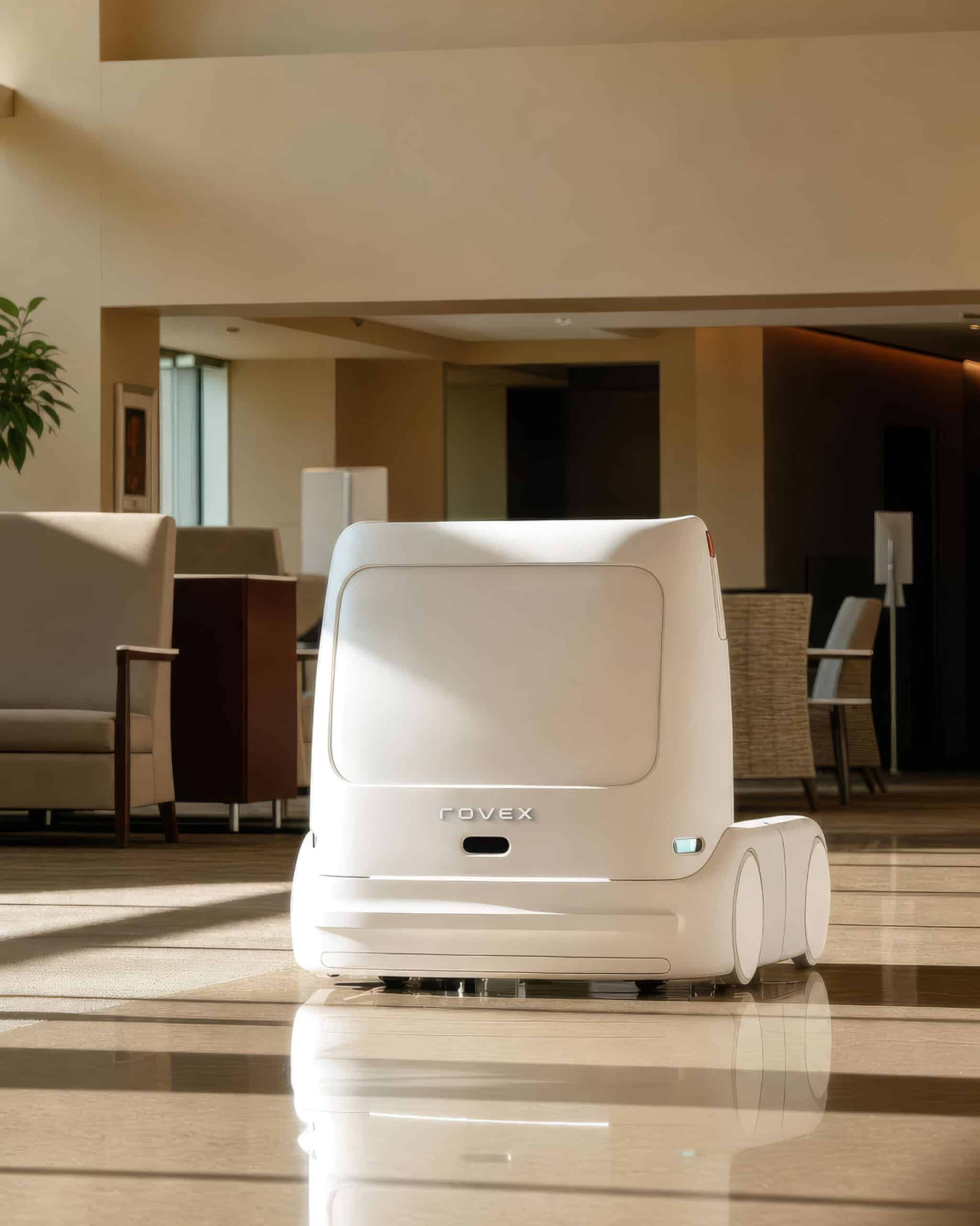
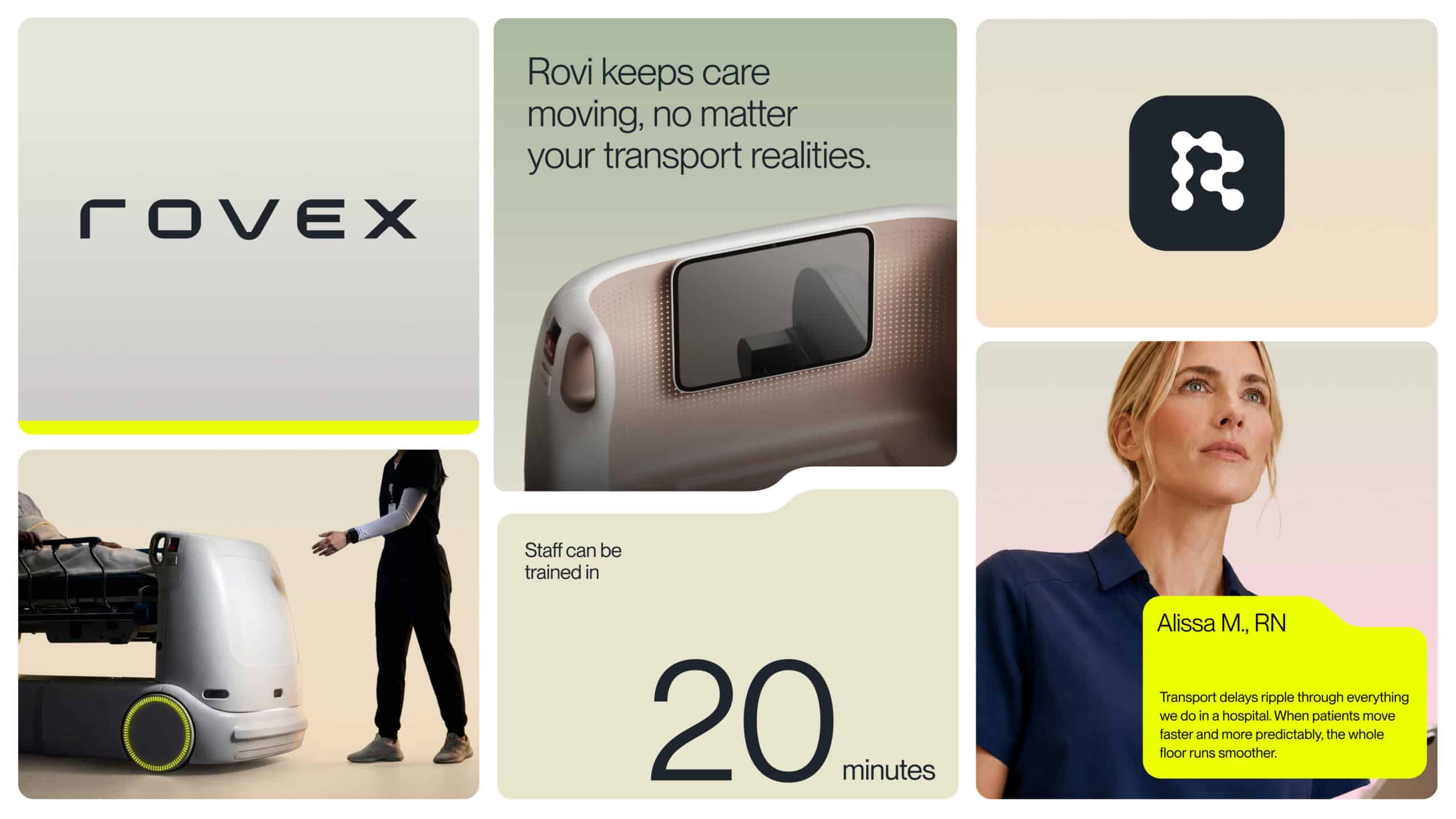
That connection became the foundation of the brand idea: “Keep care flowing.” The phrase places patient transport within the wider rhythm of the hospital, recognising how movement supports the delivery of care. When transport runs smoothly, staff have more capacity, patients move through their care journey, and the hospital can function more effectively. It gives Rovex a clear purpose grounded in the everyday needs of its audience.
To build confidence in Rovi, Red Antler focused on the preparation behind its first real journey. Before transporting a patient, the robot completes millions of virtual transports within a simulated replica of the hospital. This training became a central part of the brand story, offering a tangible explanation of how Rovi arrives prepared for its environment. An unfamiliar technology could be introduced through the familiar value of experience.
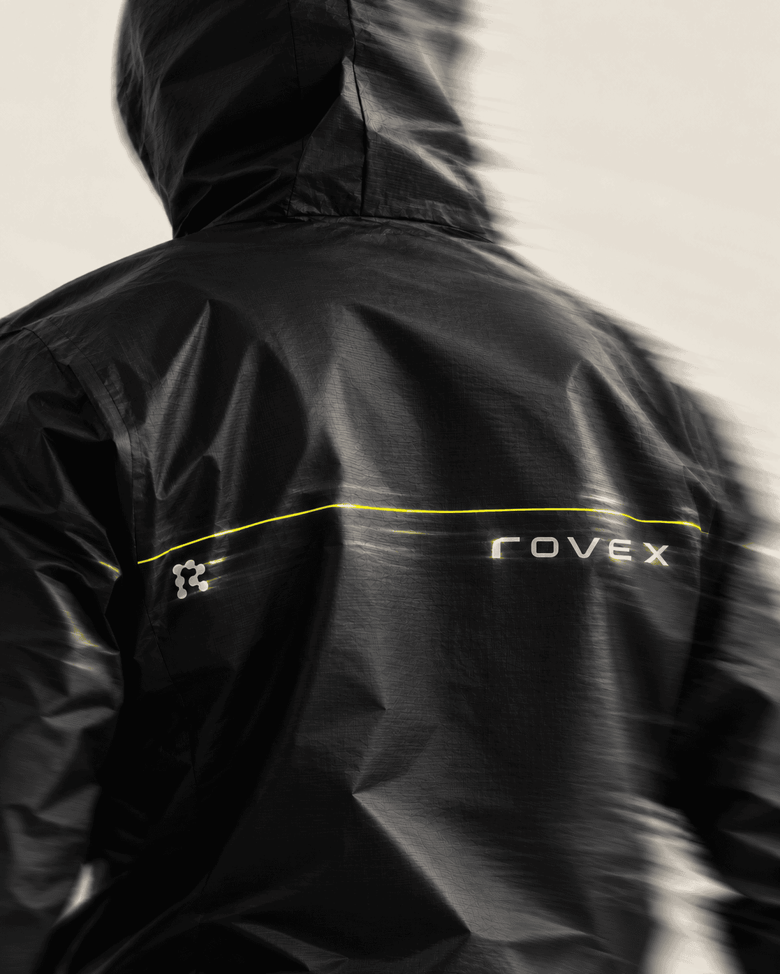
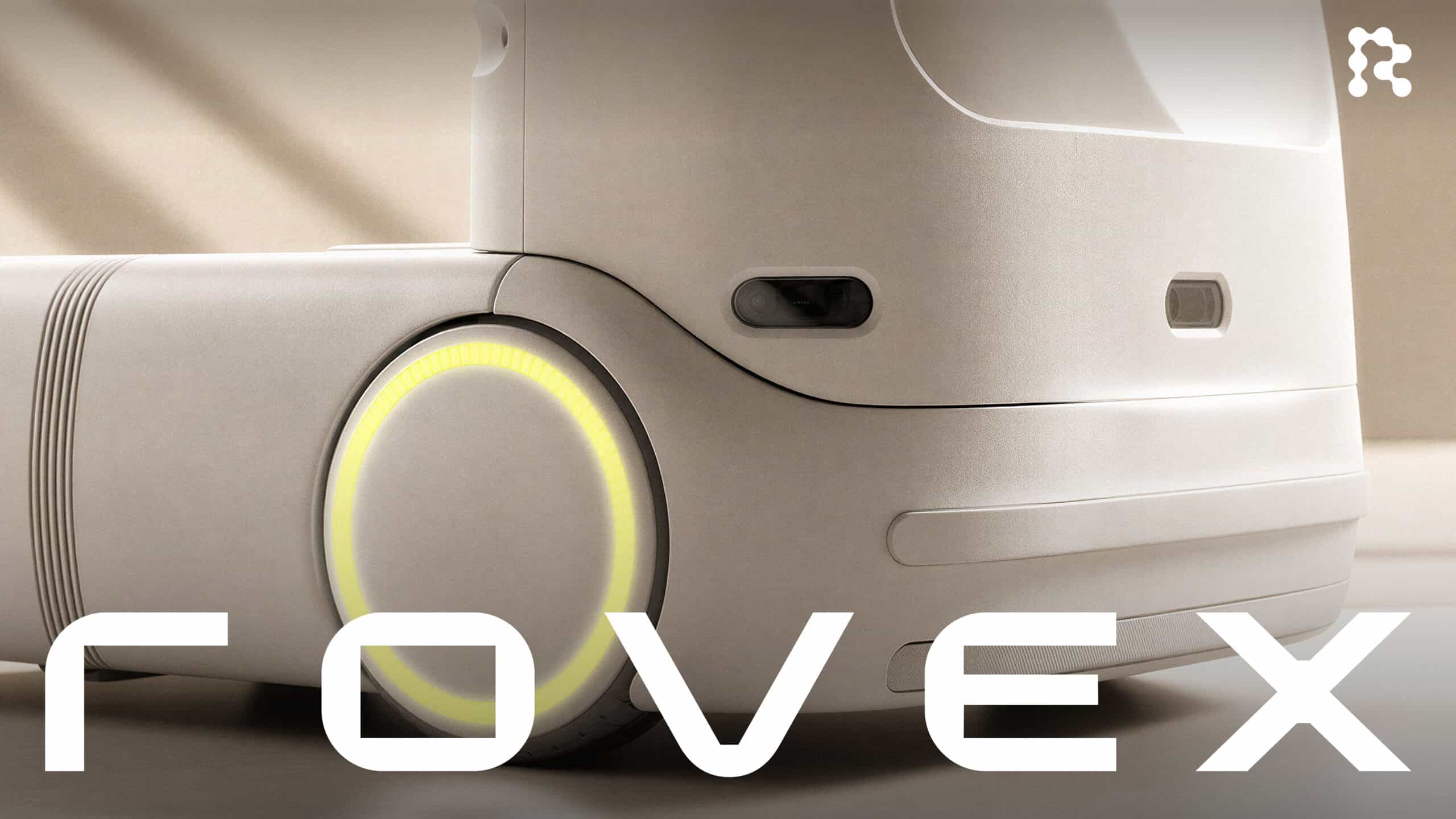
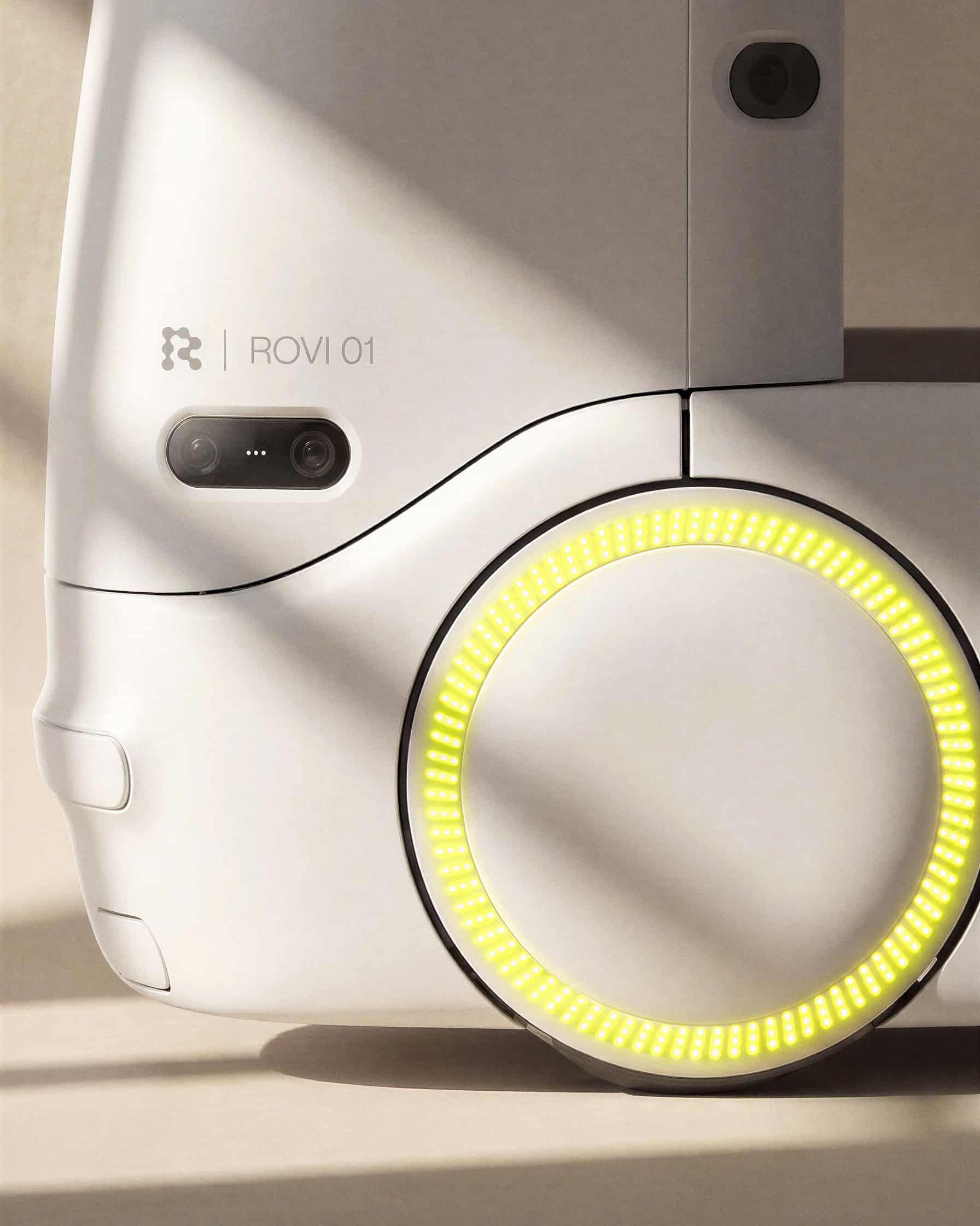
The visual identity extends that sense of readiness across the brand’s touchpoints. Path-based design connects the system to movement and navigation, while geometric precision conveys structure and control. A bright yellow gives Rovi a recognisable presence, designed to attract attention without creating alarm. Together, these elements support an identity that makes the robot feel approachable while communicating the seriousness of its role.
The project demonstrates how branding can help introduce a new category by making its value legible. Red Antler translated Rovex’s technical capabilities into a story about continuity, preparation, and care, giving hospitals a framework for understanding where Rovi fits and why it matters.
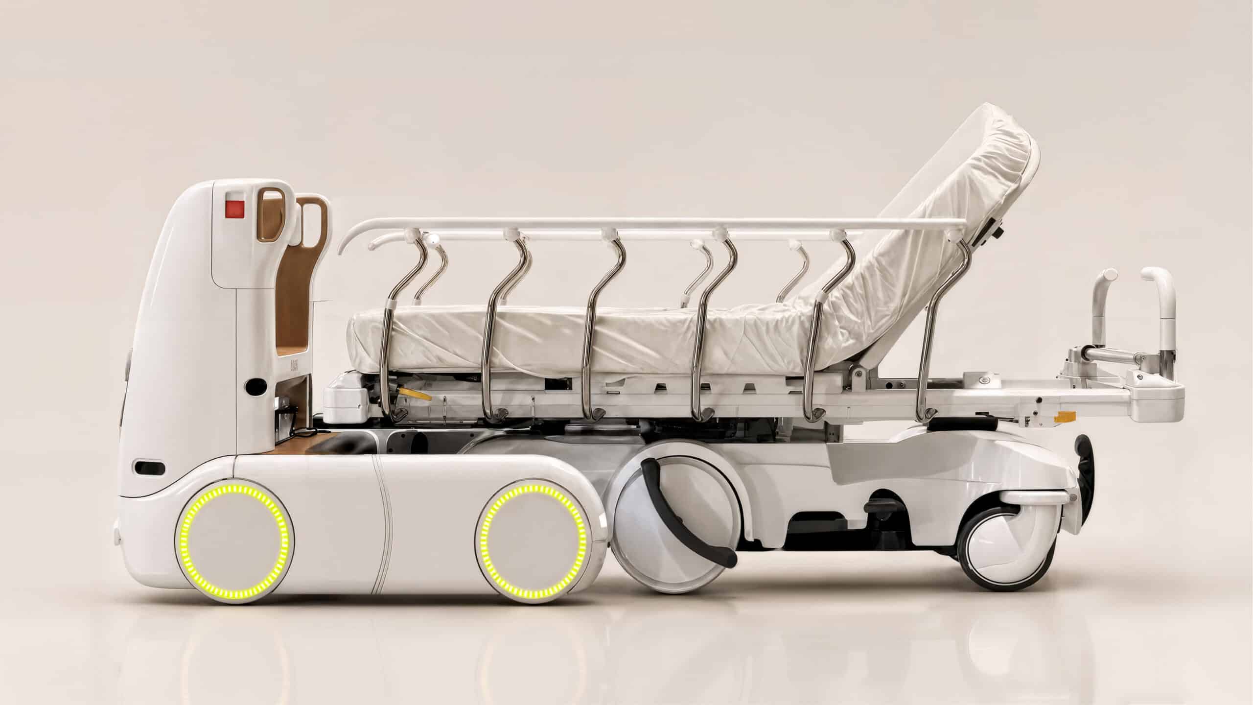
Working across strategy, design, and marketing, Red Antler helps businesses navigate transformation and define their place in emerging categories. Its collaborations include Hinge, PopUp Bagels, AllTrails, McKinsey, and Ramp. For Rovex, that approach produced a brand built around a clear ambition: to make autonomous patient transport feel like a natural next step in keeping care moving.