Masani Pizza: A Family Story Brought to Life by Saint-Urbain
For Masani Pizza, New York-based creative studio Saint-Urbain has developed a distinctive visual identity that celebrates family, friendship, and the cultural heritage of New York’s neighborhood pizzerias. Created for Mike Chau, the food personality behind Food Baby, the project transforms a deeply personal story into a warm, nostalgic, and contemporary brand experience.
After more than a decade documenting New York City’s vibrant restaurant scene, Chau decided to open a pizzeria of his own in Forest Hills, Queens. To bring the brand to life, he collaborated with longtime friend Alex Ostroff, founder and creative director of Saint-Urbain. Their relationship, built over more than ten years, became the emotional foundation of the project.
The restaurant’s name, Masani, combines the names of Chau’s three children, Matty, Sammy, and Nicky, placing family at the very center of the identity. This personal connection inspired the studio’s guiding concept, “A Family Business,” a simple yet meaningful statement that captures the restaurant’s character and ambitions.
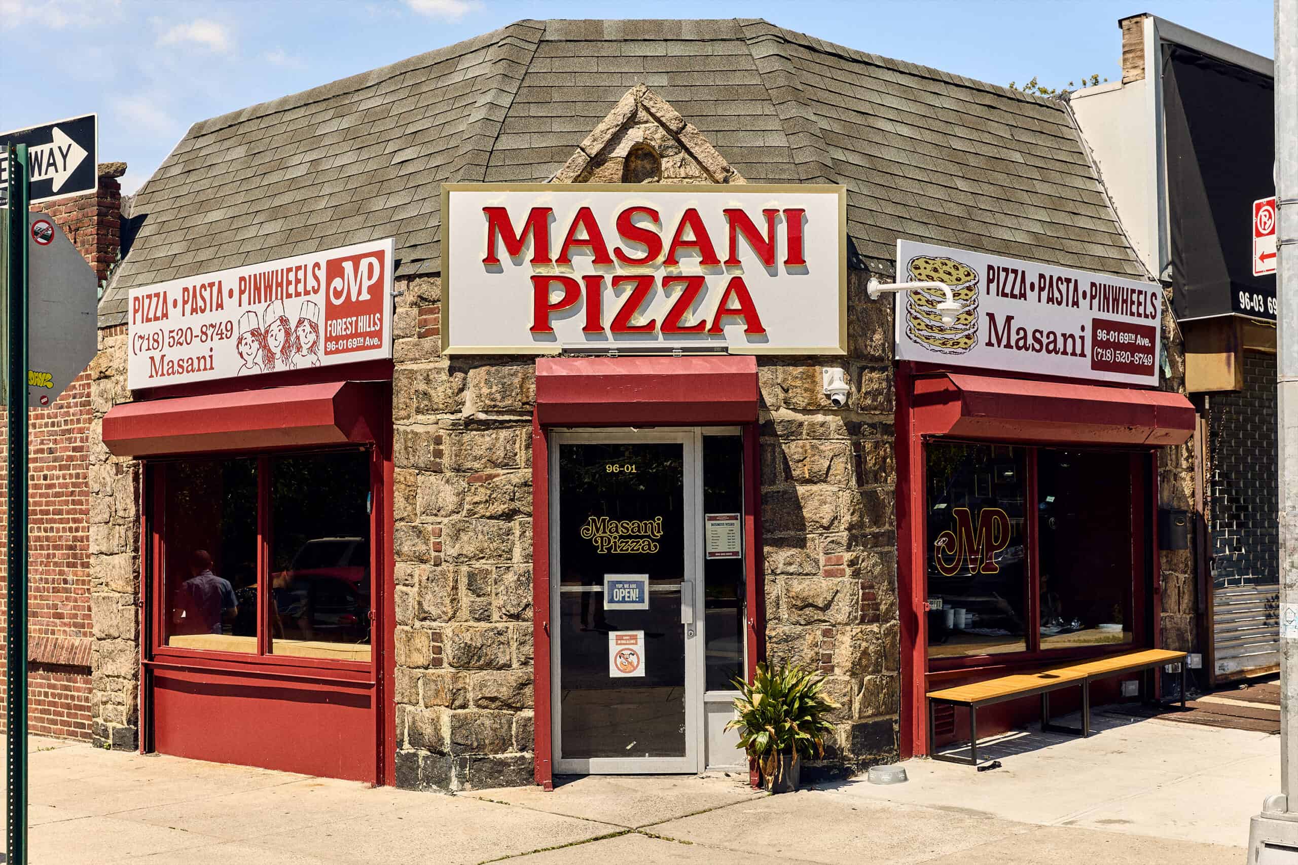
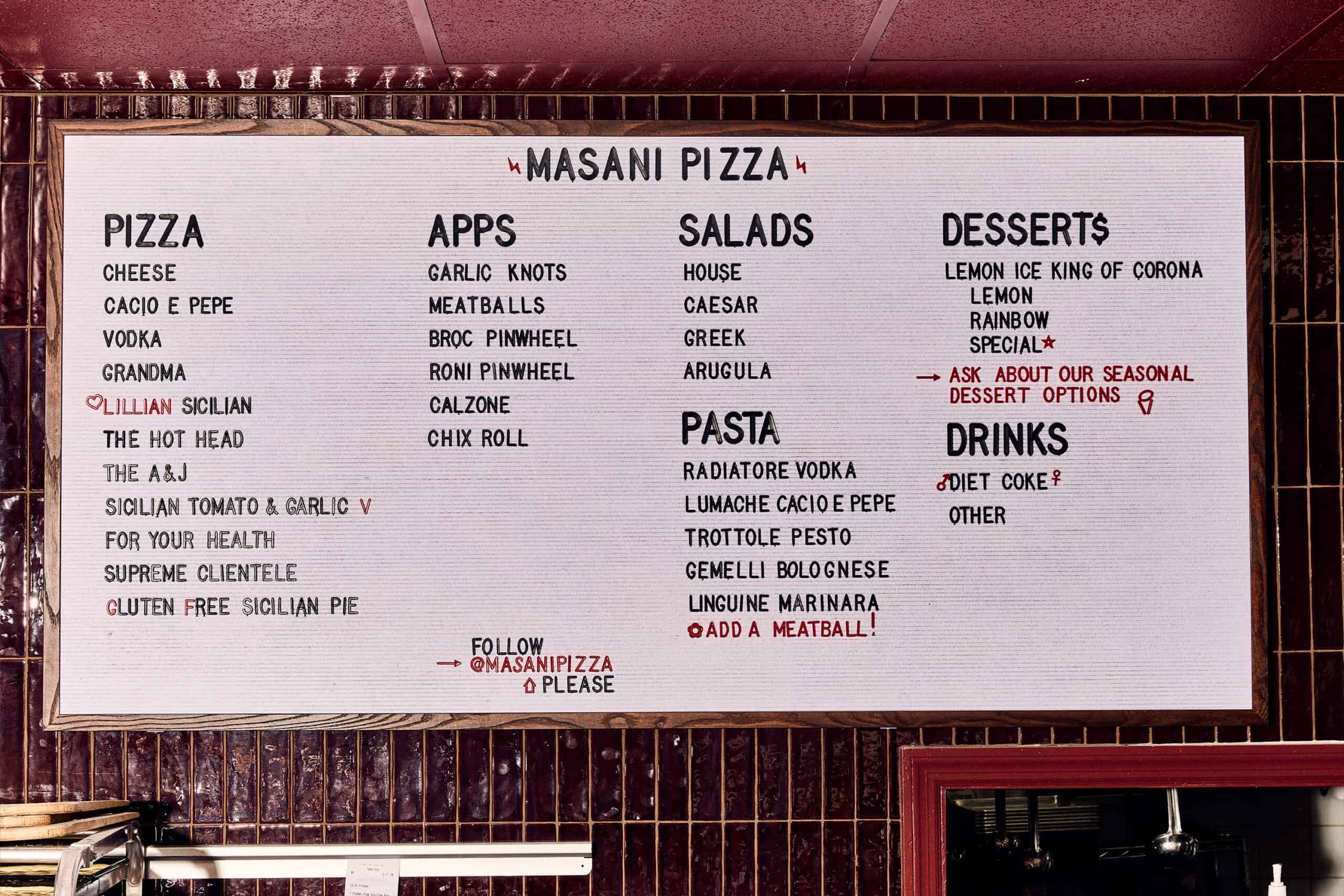
Located in the former Lillian Pizzeria, a neighborhood institution dating back to 1972, Masani Pizza carries forward an important piece of Forest Hills history. Chau grew up visiting the original restaurant with his family and later shared the same experience with his children. Rather than erasing that legacy, Saint-Urbain sought to preserve its familiar spirit while introducing a fresh visual language.
The creative direction draws inspiration from vintage American pizza chains, archival Forest Hills Stadium posters, classic New York signage, and the visual culture of the city’s restaurants. References to McPizza, Jack in the Box, and Pizza Hut helped inform a nostalgic aesthetic, carefully reinterpreted to create something unmistakably Masani.
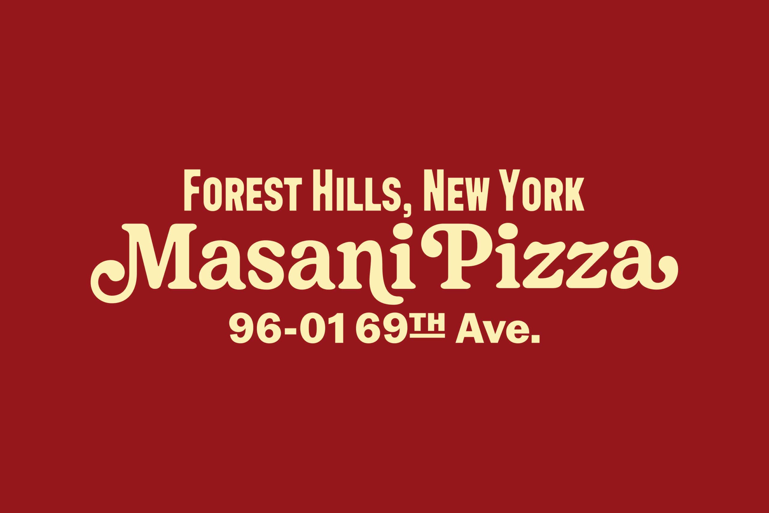
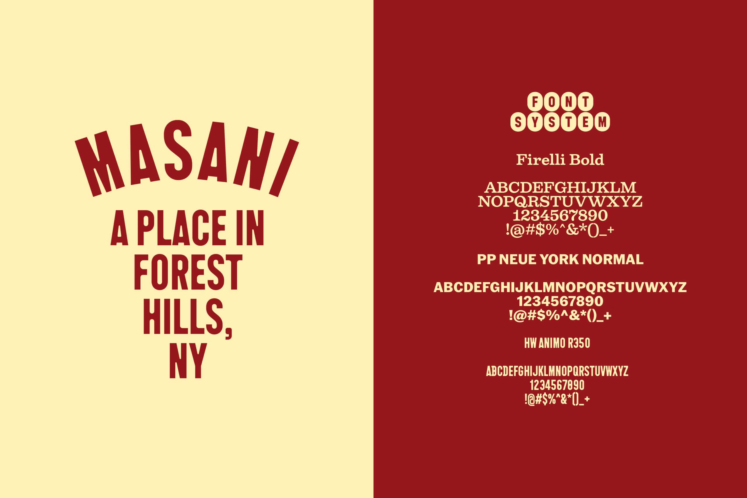
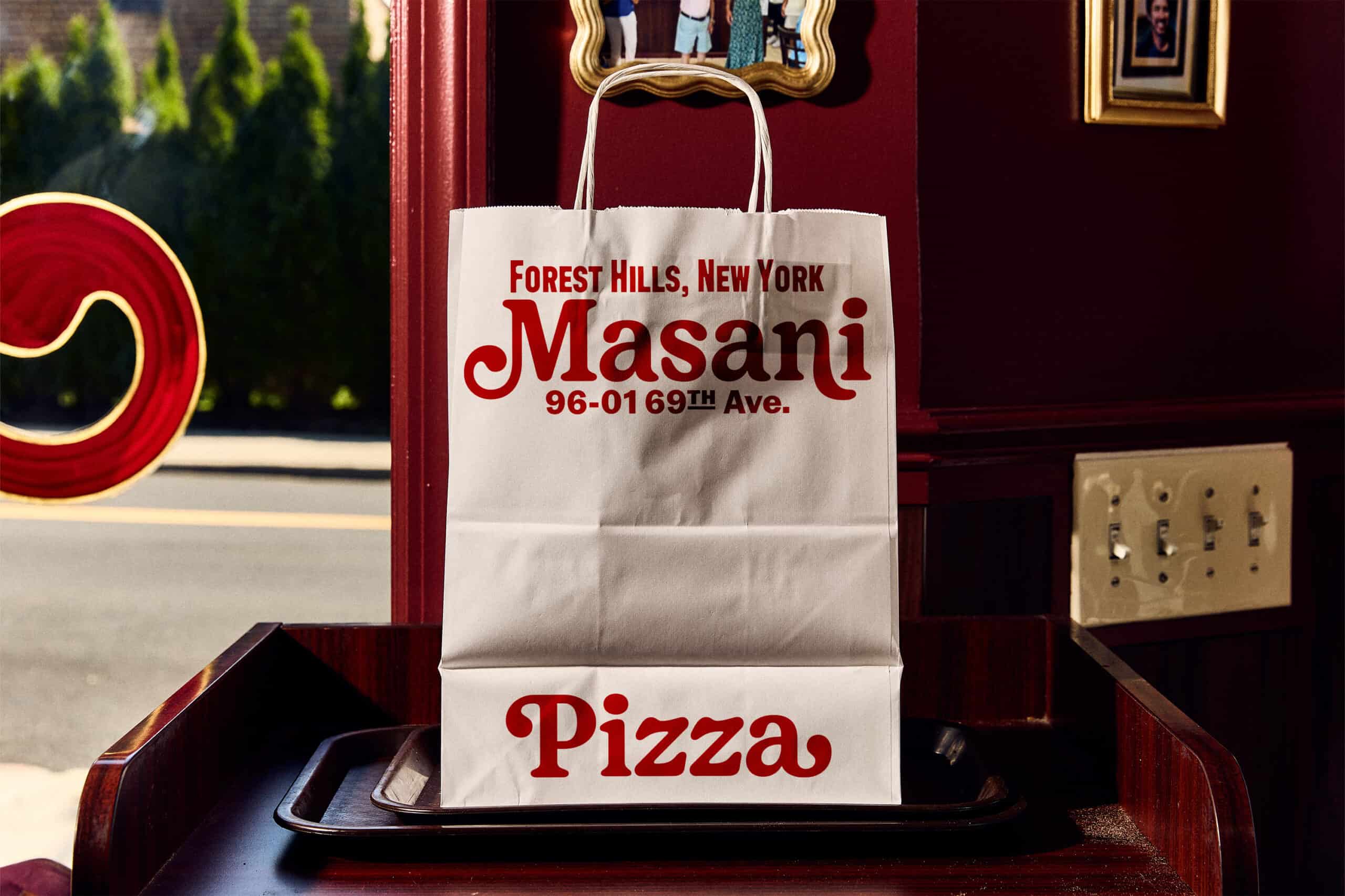
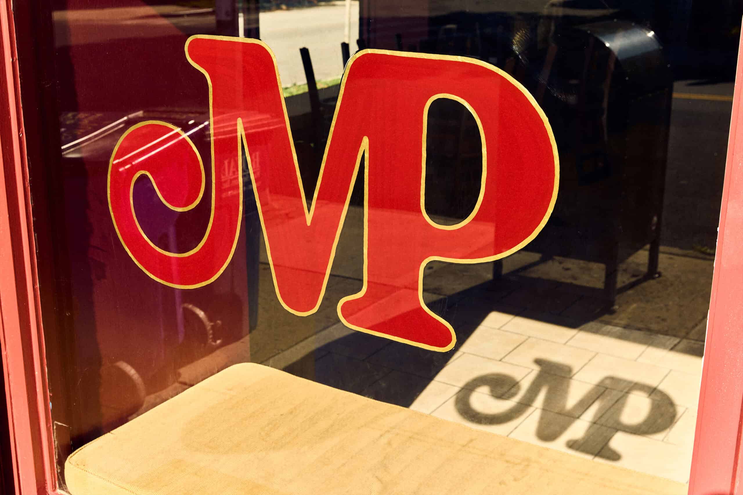
At the heart of the identity is a custom hand-drawn wordmark featuring expressive flared serifs, organic curves, and subtle imperfections. Its playful yet sophisticated character evokes the warmth of traditional neighborhood establishments while establishing a recognizable contemporary personality. The typography is complemented by PP Neue York Normal, Firelli Bold, and HW Animo R350, creating a visual balance between nostalgic charm and modern graphic clarity.
A rich burgundy color palette reinforces the restaurant’s welcoming atmosphere, while one of the project’s most meaningful elements comes through a series of hand-drawn portraits of Chau’s three children. Developed from Ostroff’s personal photographs and refined in collaboration with the family, the illustrations appear throughout the identity, including on the restaurant’s exterior.
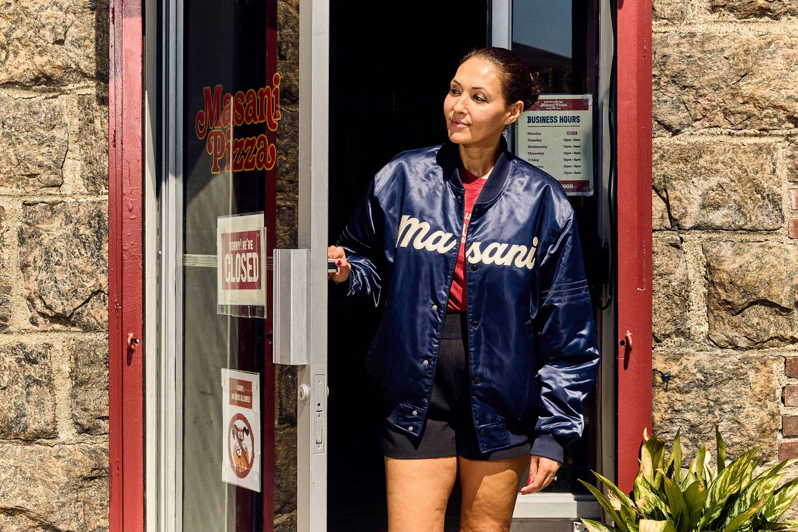
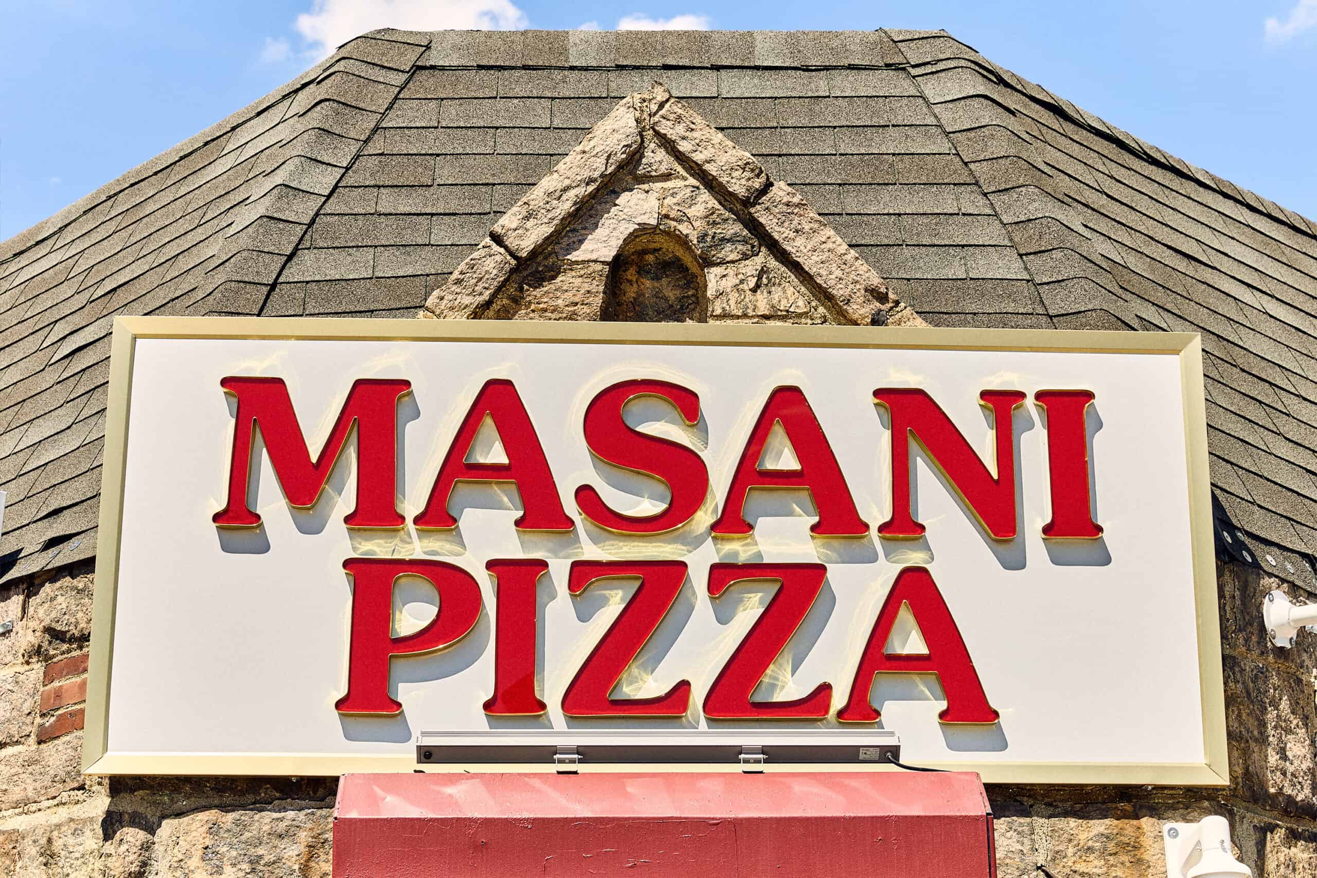
The studio also paid tribute to the building’s past by adapting the original Lillian Pizza storefront lettering into the new Masani Pizza signage, creating a visual connection between generations of neighborhood history.
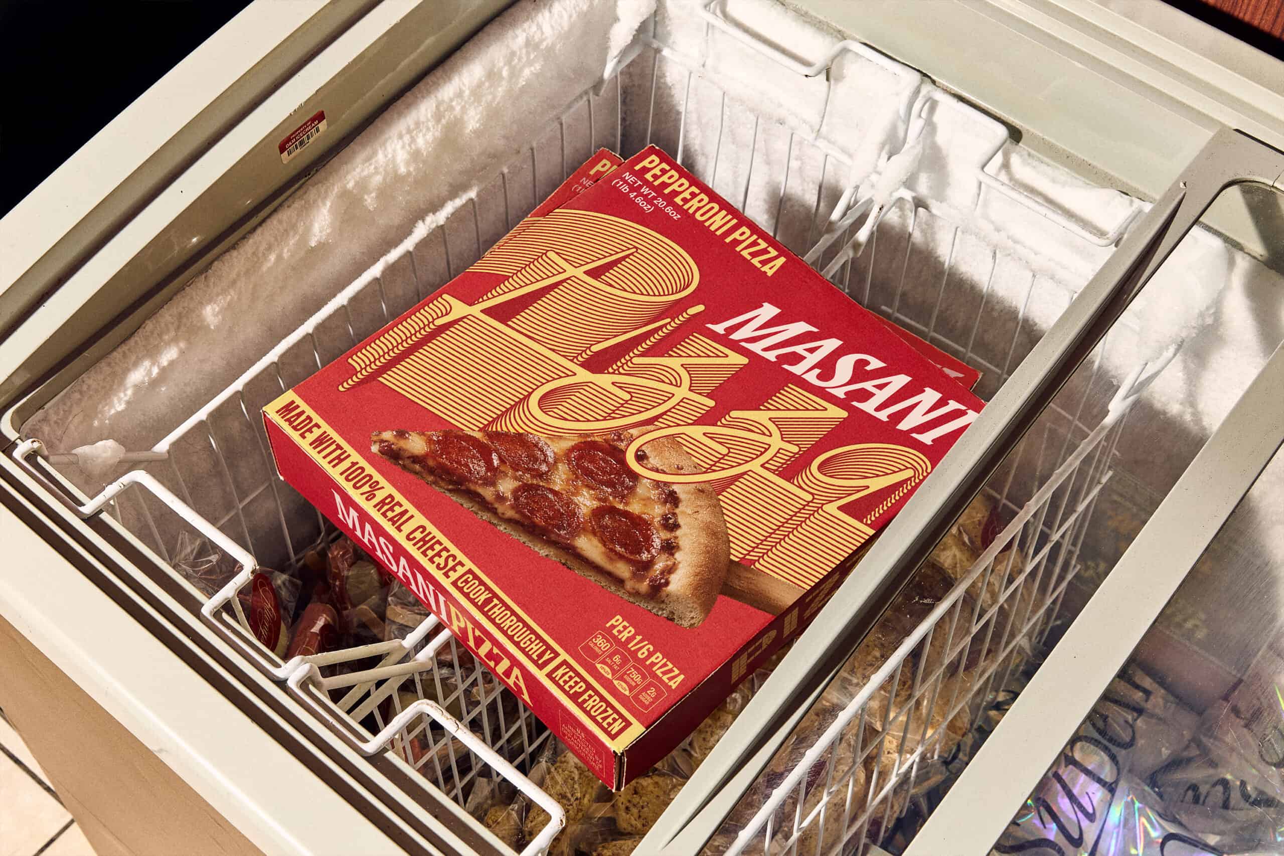
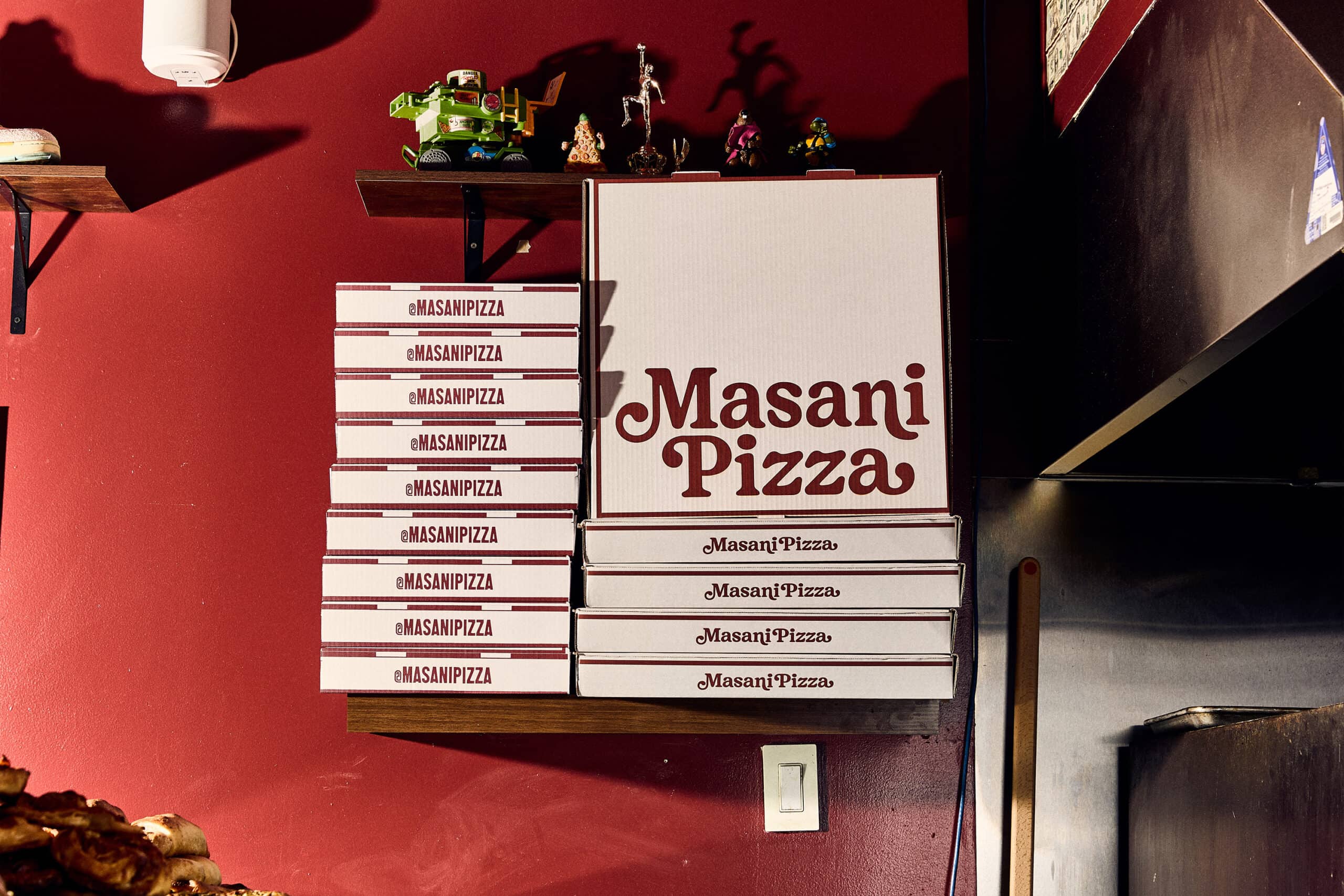
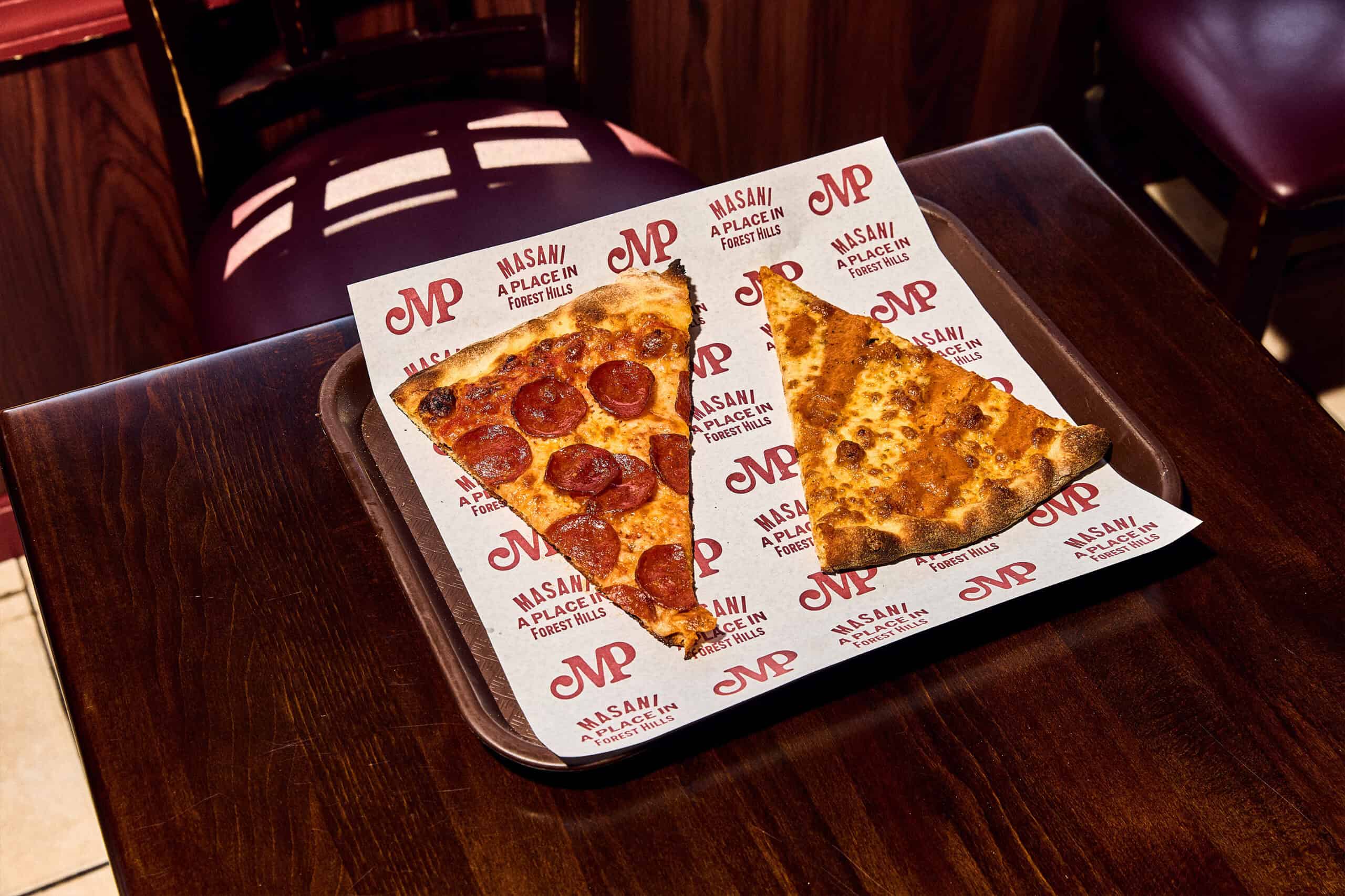
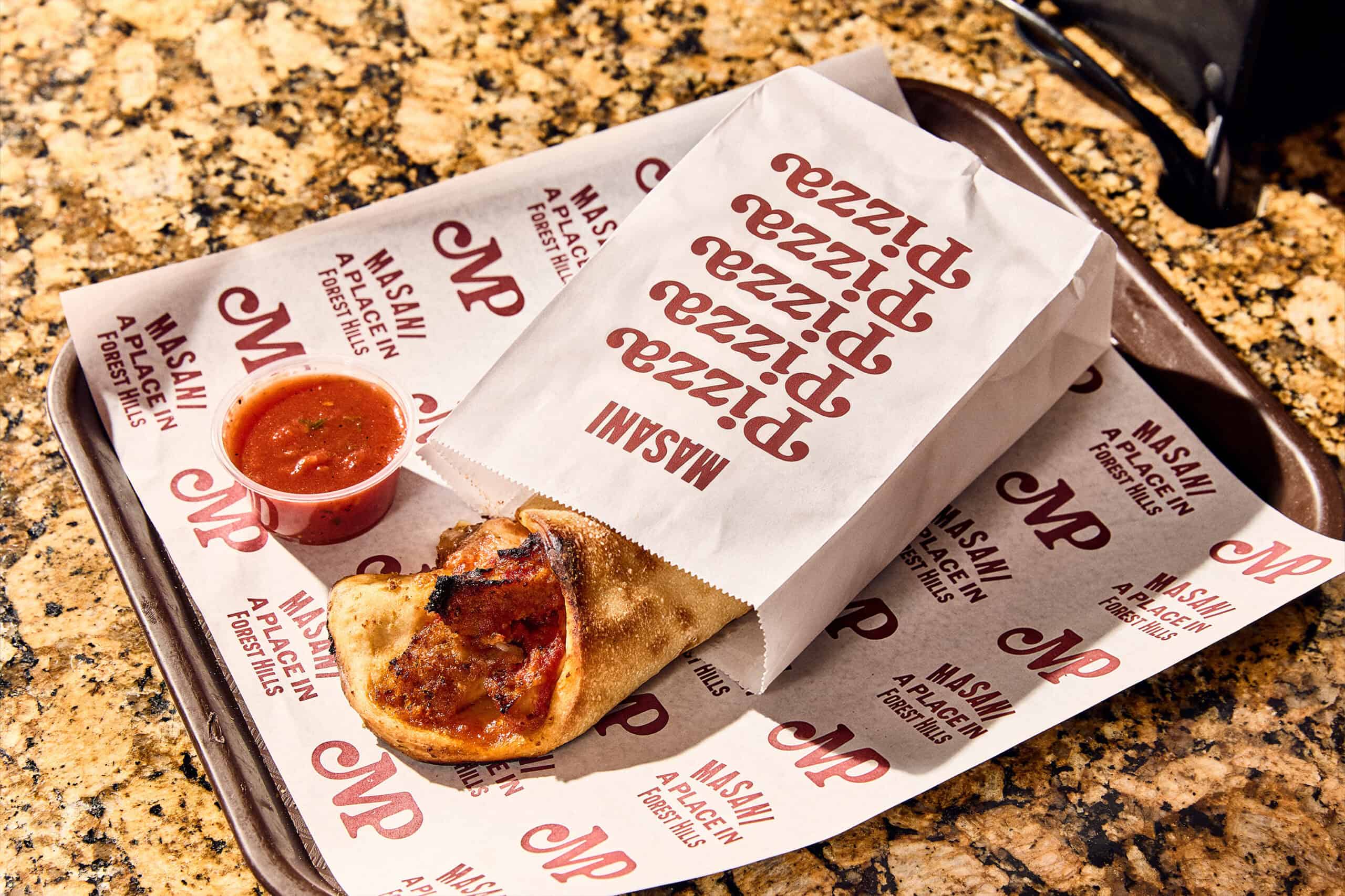
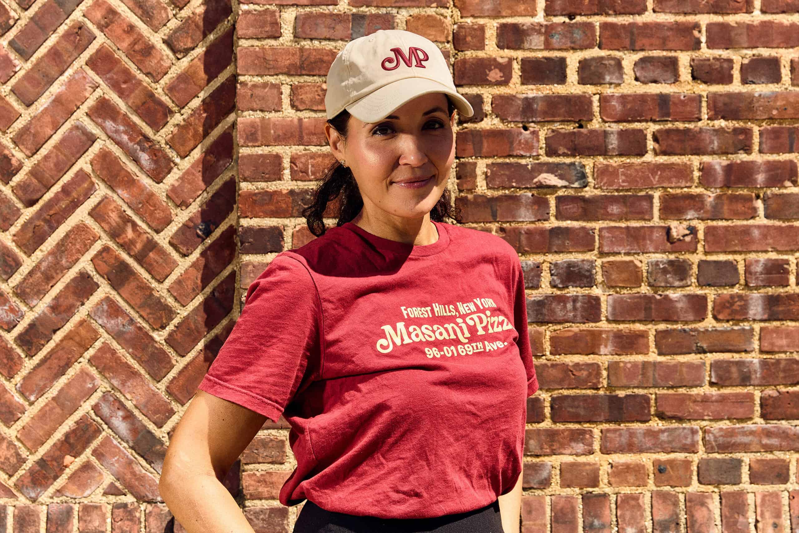
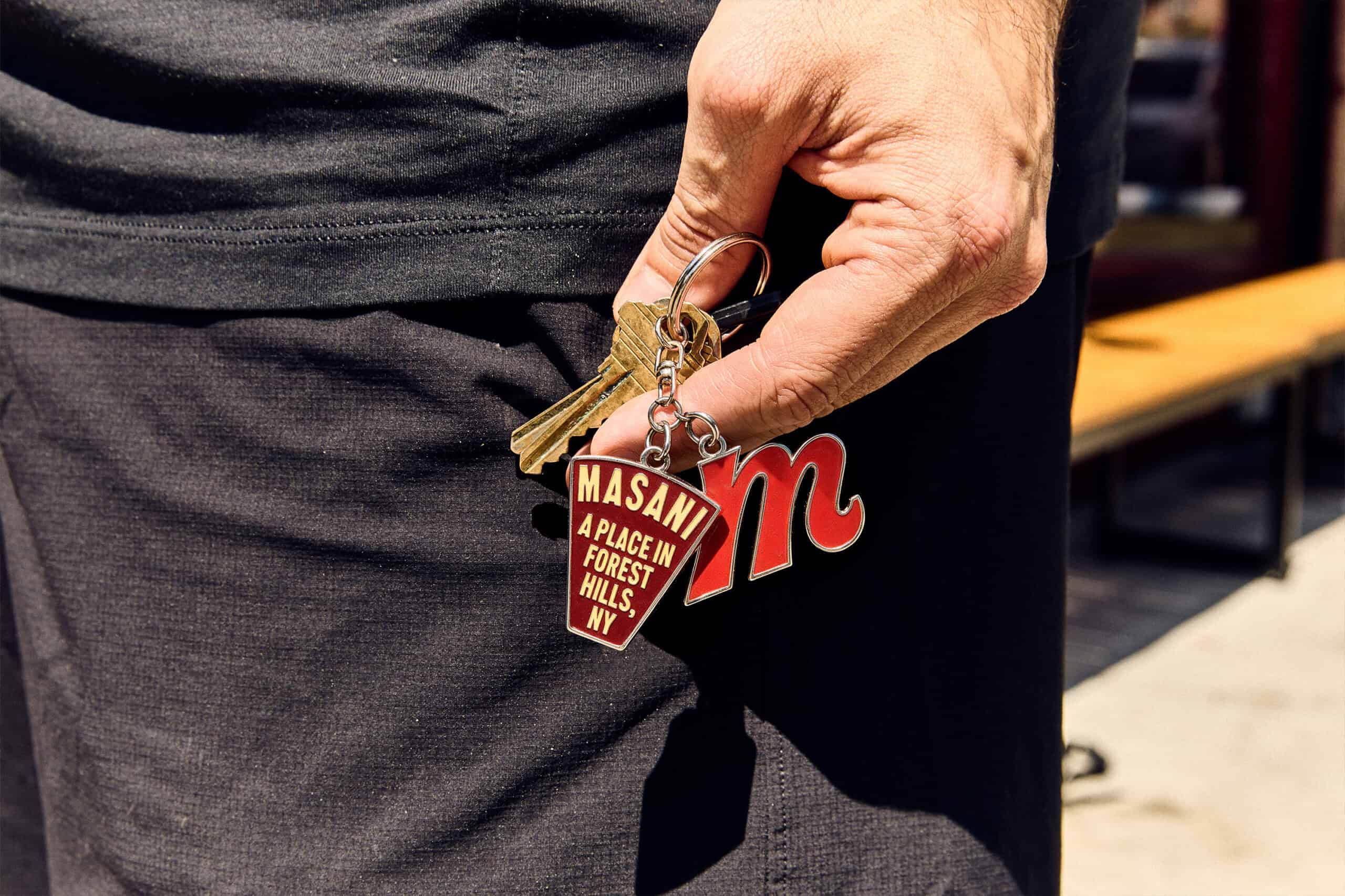
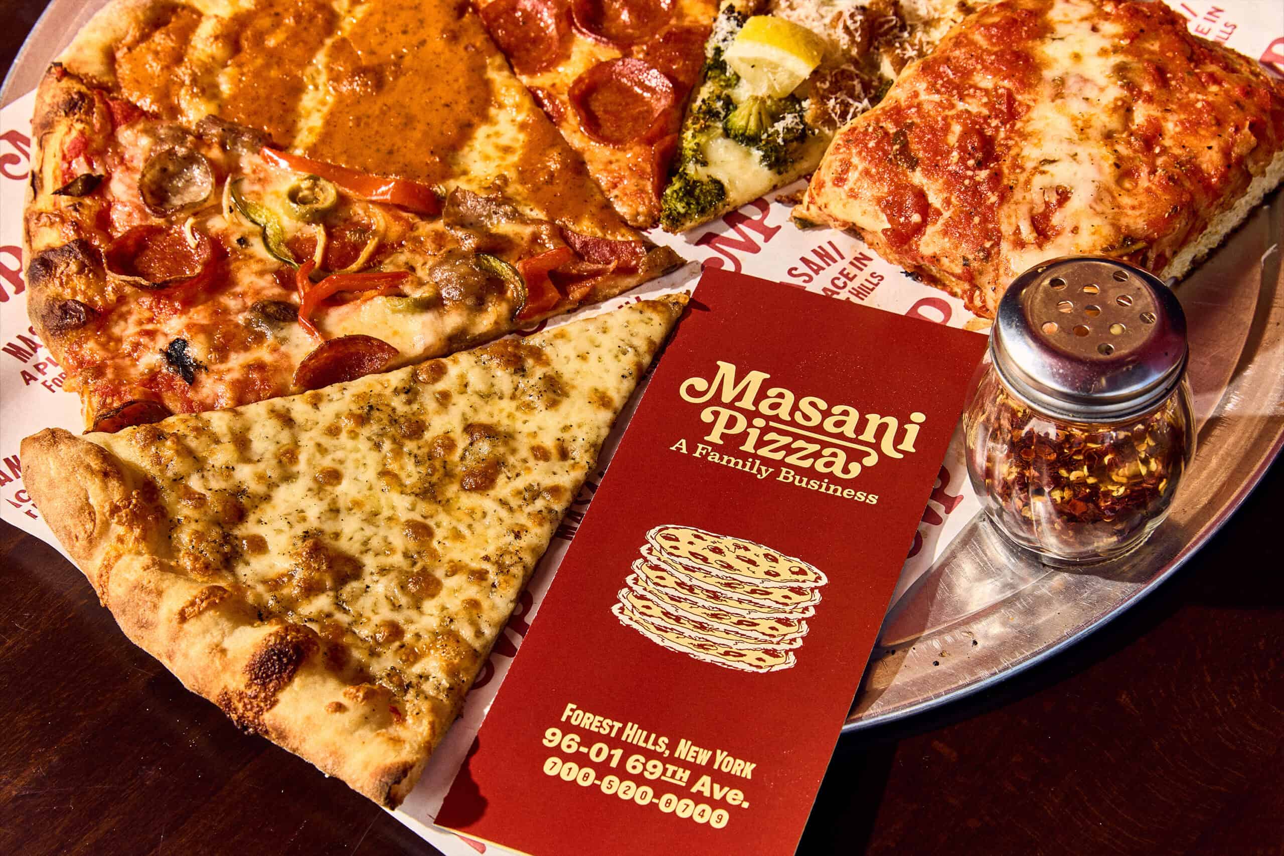
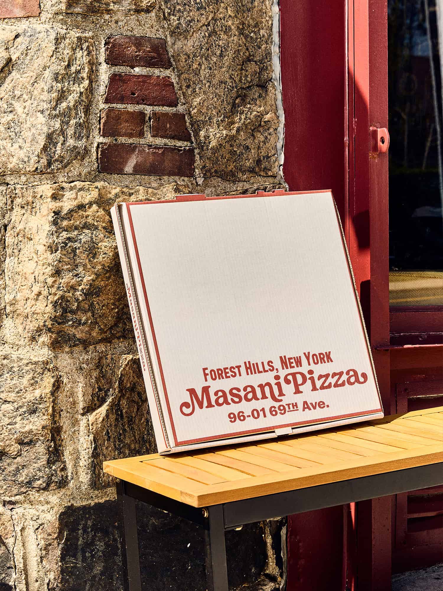
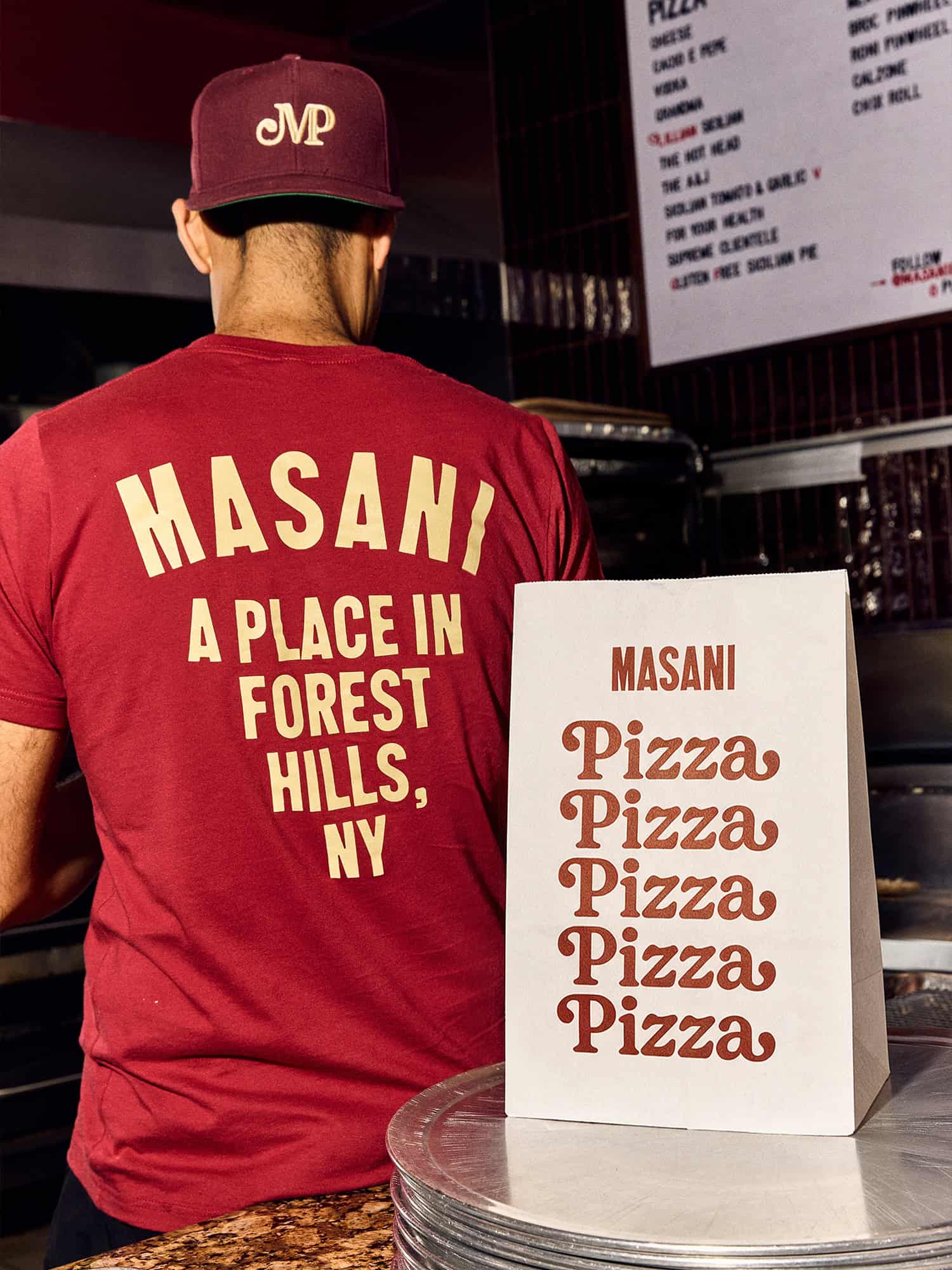
Beyond the core identity, Saint-Urbain developed an extensive collection of branded applications, including three different pizza box designs, takeaway packaging, matchbooks, signage, and merchandise. The system also extends into more unexpected formats, such as a custom bomber jacket and packaging for a frozen pizza range planned for 2027.
Throughout the project, Saint-Urbain approached branding as something more meaningful than a visual exercise. Every detail was designed to reflect the people behind the restaurant, their memories, and their relationship with the neighborhood.
Masani Pizza represents an identity built around genuine human connections, where nostalgia meets contemporary design and personal history becomes a recognizable brand language. Through expressive typography, thoughtful illustration, and carefully considered applications, Saint-Urbain has created a visual world that feels both familiar and entirely its own, designed not only for a restaurant, but for a family and the generations that may follow.