I MILLE Reframes Tax and Legal Advisory Through BC&’s New Identity
Creative agency I MILLE developed a complete rebrand for BC&, a corporate and tax advisory studio founded in Milan in 1997. Encompassing positioning, verbal identity, visual system and website, the project challenges the conventional codes of Italy’s legal and tax sector, where authority is often communicated through institutional colors, formal language and visual distance.
Over nearly three decades, BC& has built an approach based on expertise, creative thinking and collaboration. Rather than simply providing standardized answers, the studio works alongside its clients to explore problems from new perspectives. I MILLE translated this attitude into the positioning “Not a Tax & Legal Studio – Professionisti oltre gli schemi,” presenting BC& as a firm capable of moving beyond established frameworks.
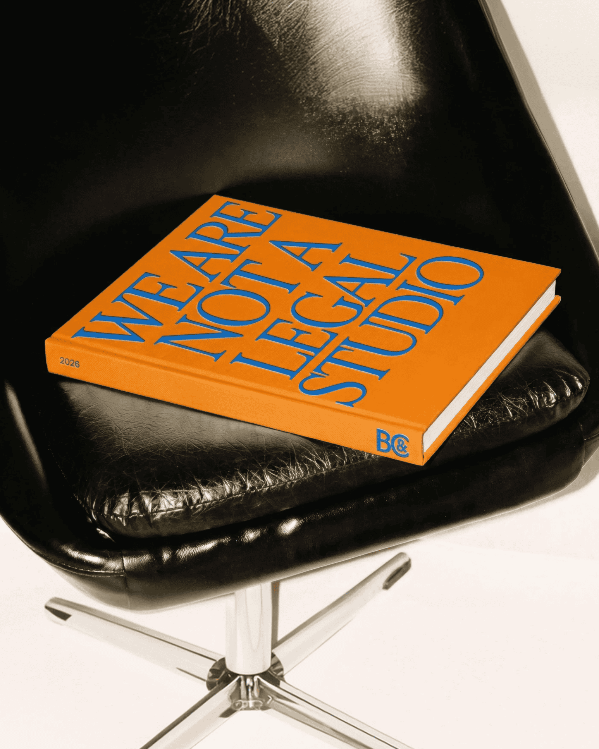
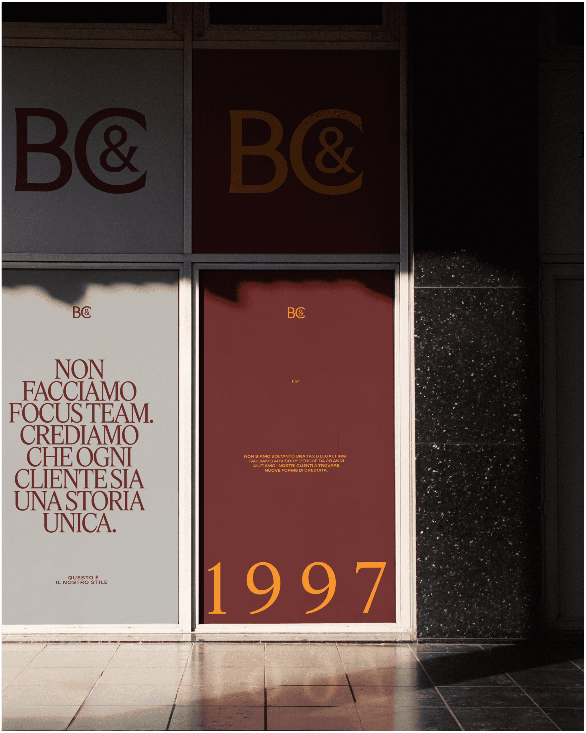
The identity draws from the visual languages of fashion, art and design, with a particular connection to Milan and its creative culture. Precision replaces institutional weight, while confidence takes the place of formality. BC&’s signature orange is paired with deep burgundy, creating a distinctive palette that breaks away from the muted colors traditionally associated with professional services.
An expressive serif logotype balances authority and personality, allowing the BC& wordmark to work across both formal and more experimental applications. This contrast also shapes the broader visual and verbal system, reflecting a brand that understands the conventions of its field well enough to challenge them.
The verbal identity is built around four values: estro—ingenuity, competenza—expertise, sintonia—attunement, and impegno—commitment. Together, they define a clear and precise tone of voice that communicates almost thirty years of experience without relying on the distant language commonly used within the sector.
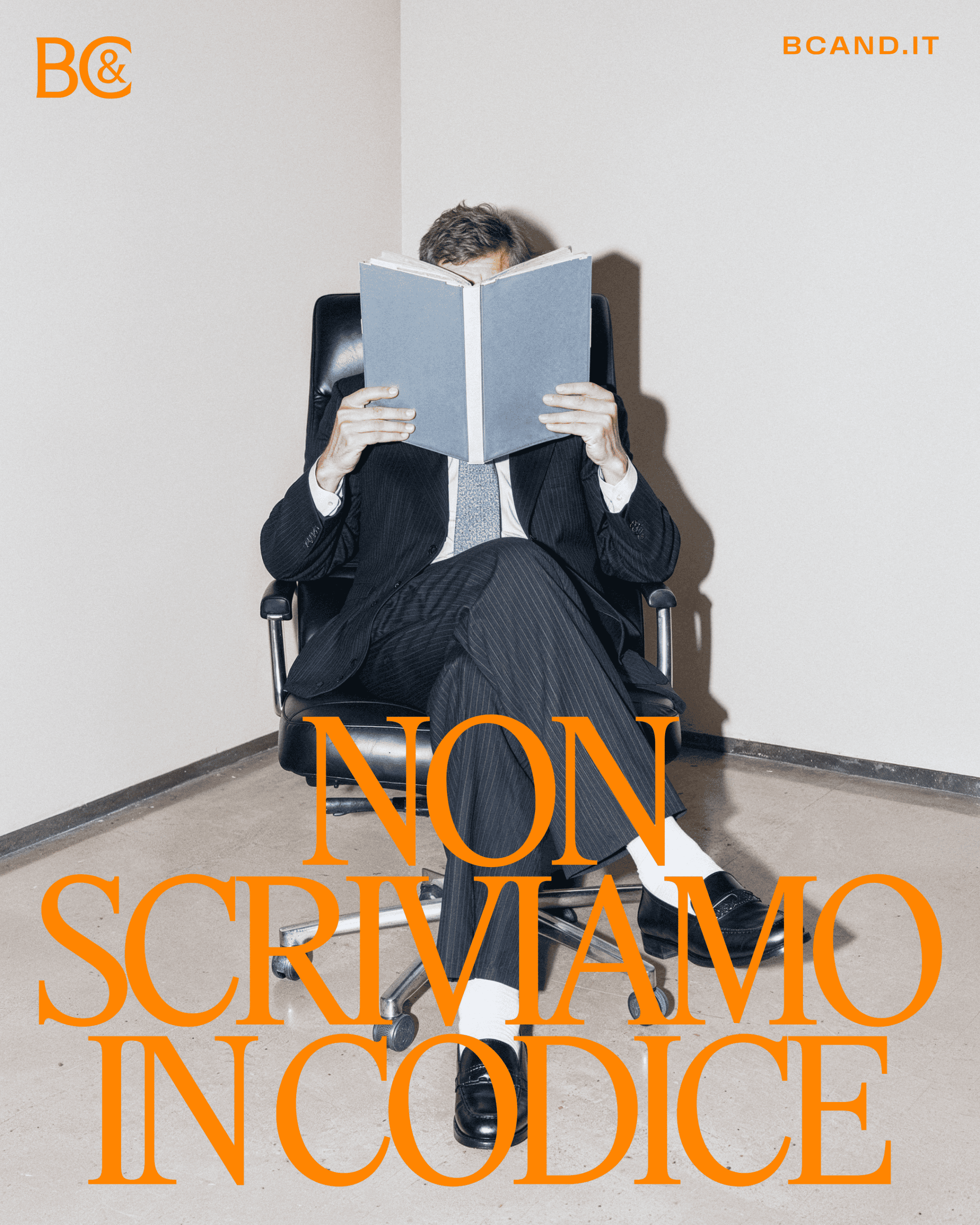
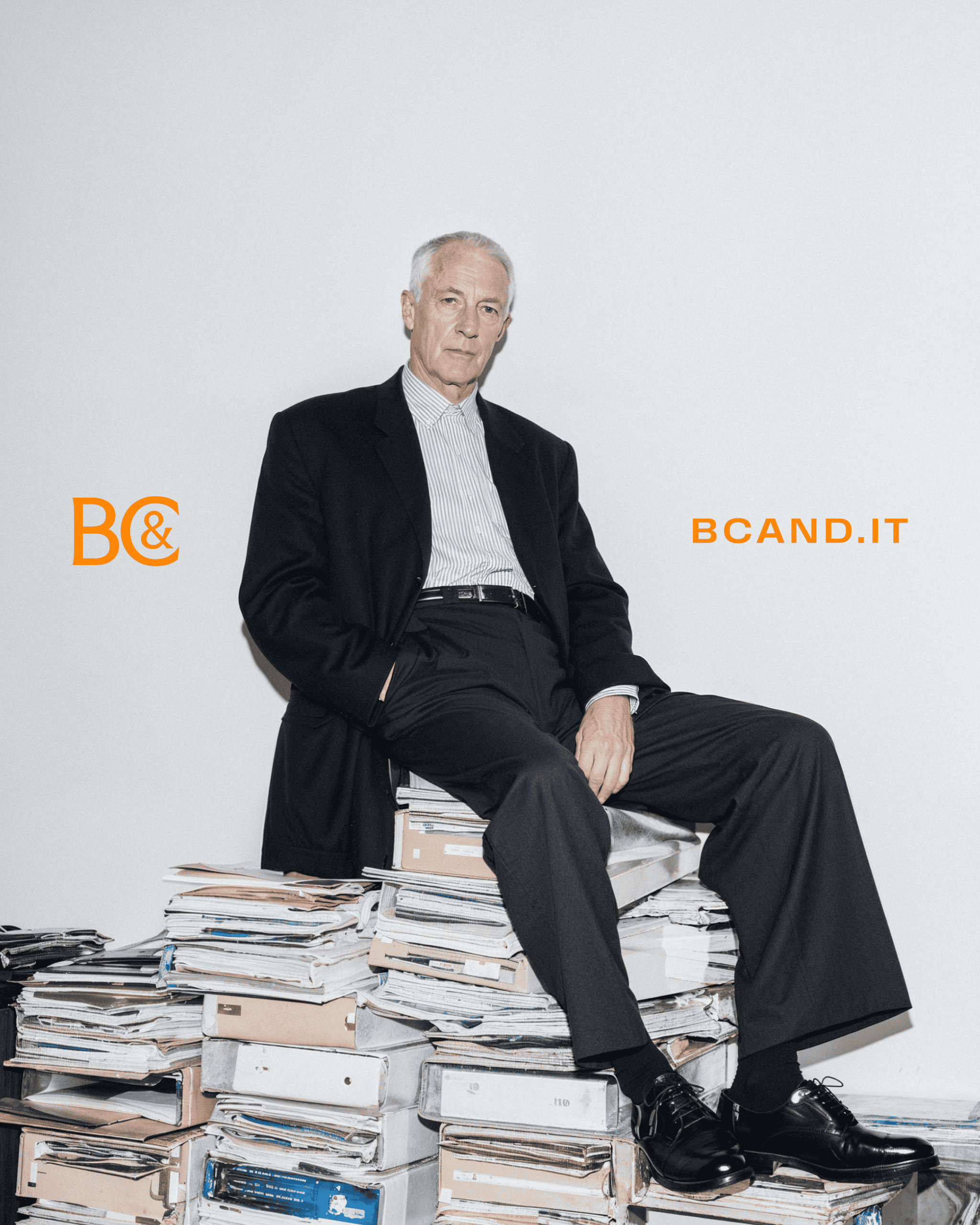

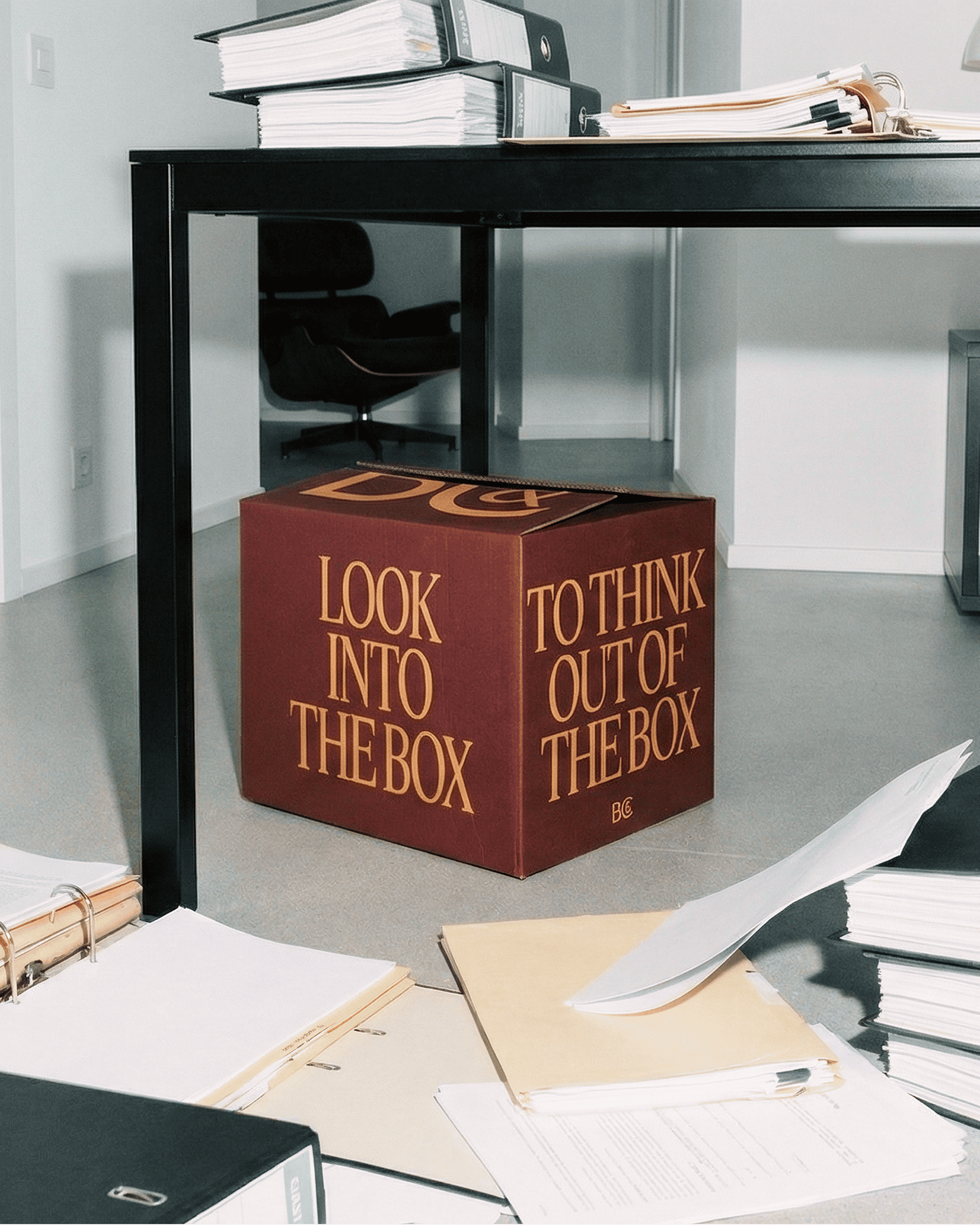
The art direction further expands this unconventional approach. Using an AI-assisted process, I MILLE transformed individual black-and-white reference photographs into full-body editorial portraits set in contemporary office environments. More reminiscent of a fashion magazine than a traditional corporate profile, the images present BC&’s professionals with a composed yet distinctive presence.
The new website brings the positioning, language and visual system together in a cohesive digital experience. Across every element, the identity presents a different model of professional authority: knowledgeable but approachable, rigorous yet imaginative, and shaped by a willingness to look beyond the expected.