Bombo Type Display: Gaia Panfoli Translates the Energy of a Bumblebee into Letterforms
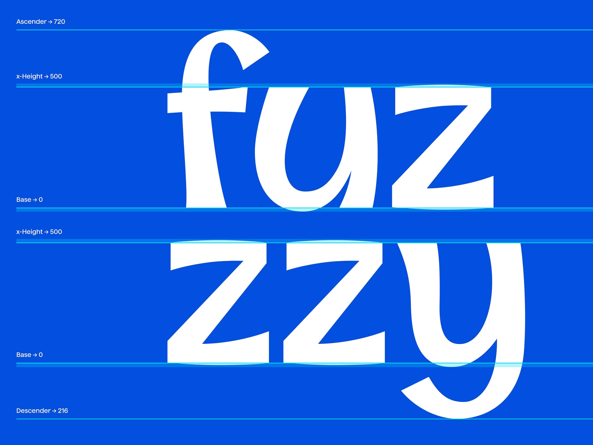
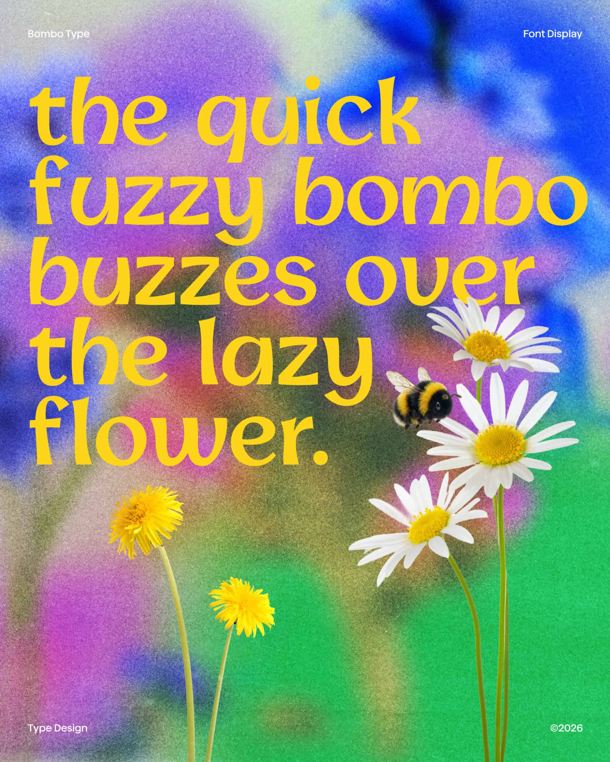
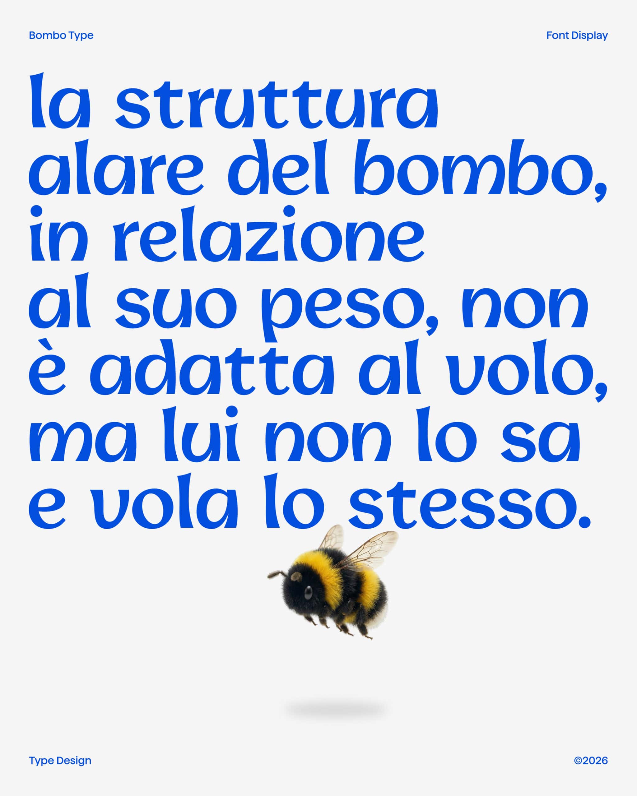
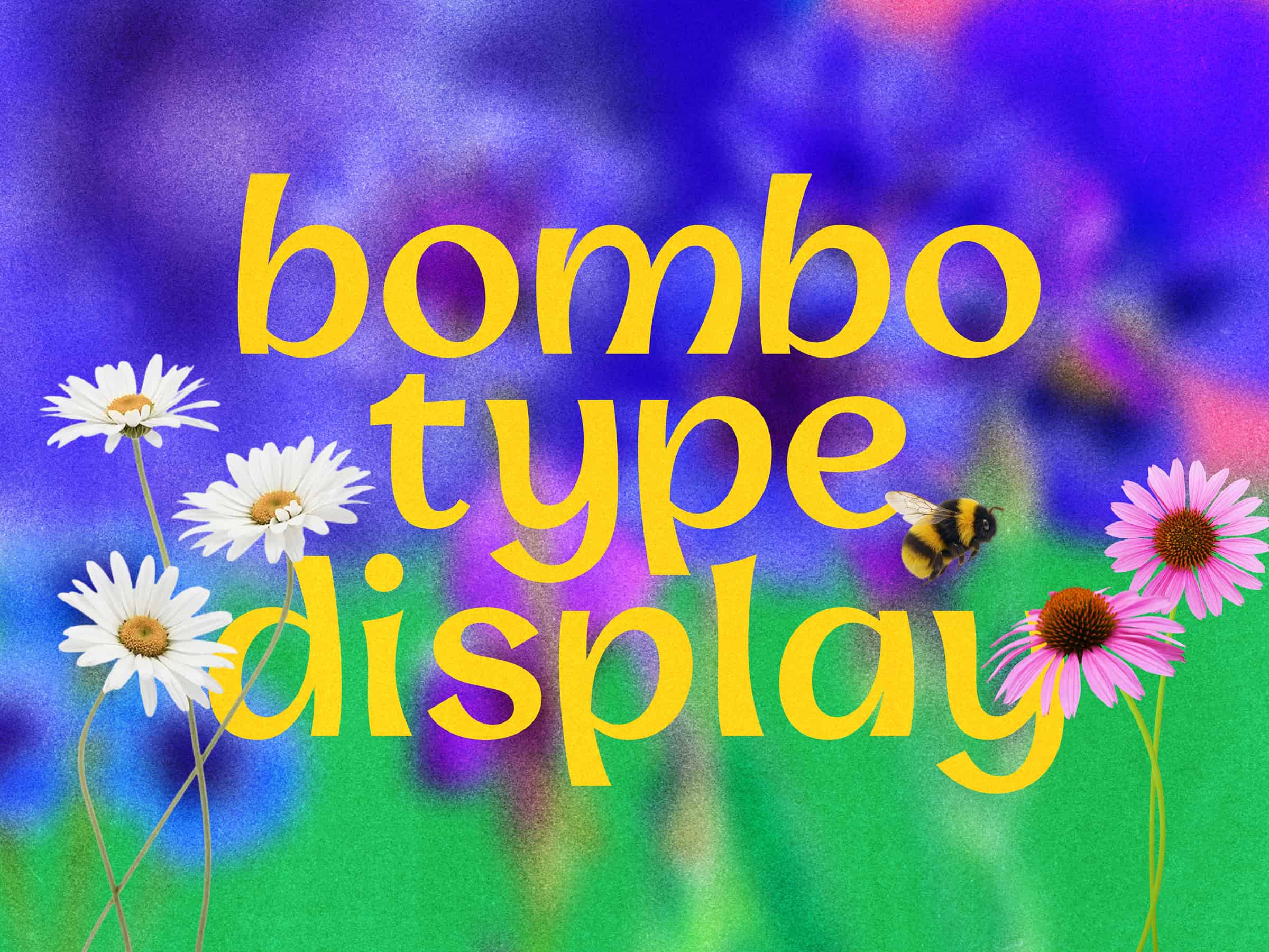
Bombo Type Display by Gaia Panfoli draws inspiration from the rounded forms of the bumblebee and the lively movement of its wings. Translating these qualities into typography, the project brings together softness, energy, and a confident graphic presence. The result is a display typeface with an airy, friendly character and a distinctly playful tone of voice.
The starting point is both the insect’s shape and the motion that carries it through the air. A bumblebee’s flight depends on rapidly beating wings that rotate and change angle, producing the vortices needed to generate lift. This combination of rounded volume and dynamic movement provides the conceptual foundation for Bombo Type, connecting the appearance of the letterforms with a sense of lightness and vitality.
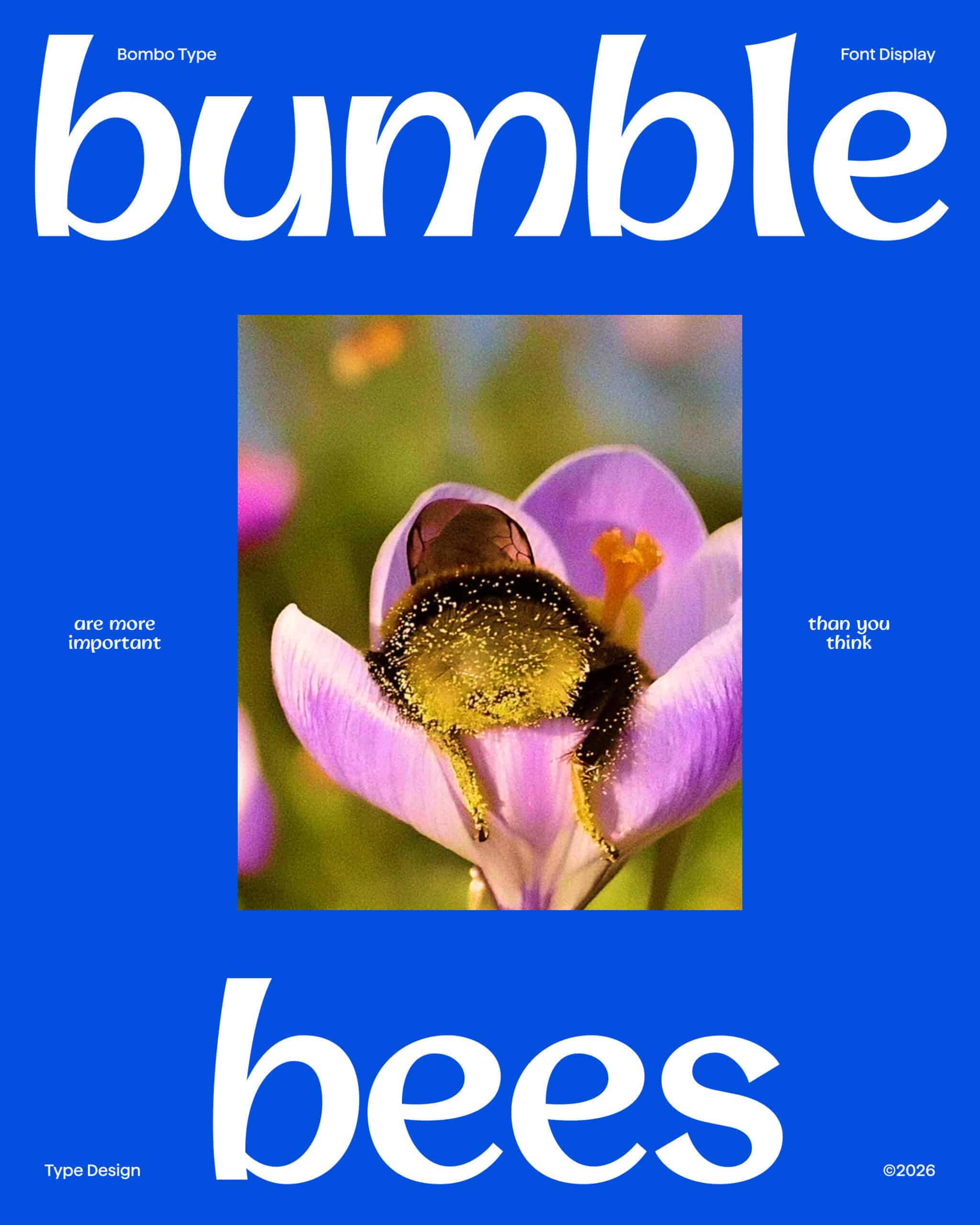
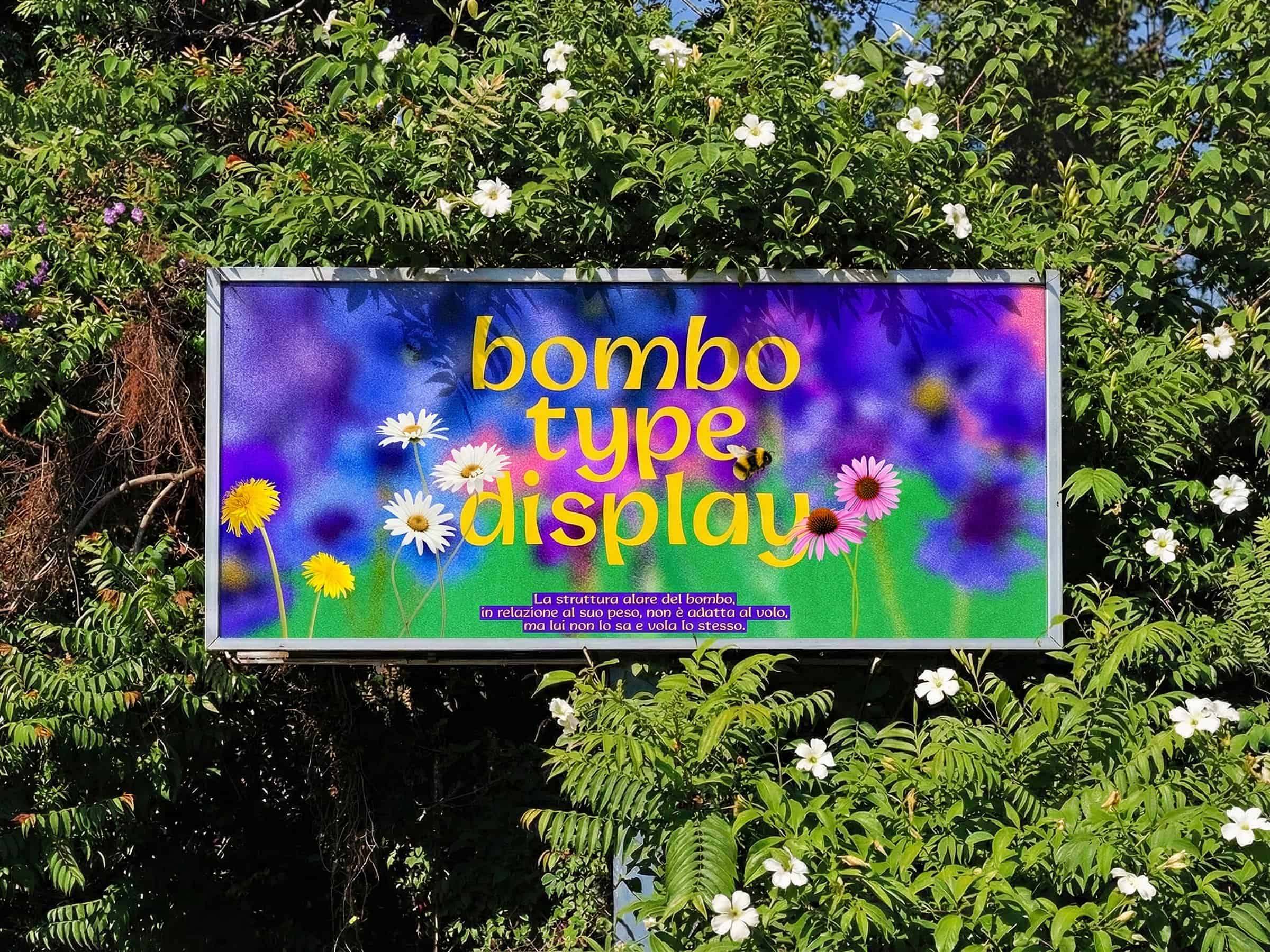
The project also references the familiar saying that a bumblebee should not be able to fly, yet does so anyway. Used as a metaphor, the phrase captures a spirit of possibility and unexpected confidence. That attitude finds a typographic expression in soft lines that retain a strong presence, giving Bombo Type a welcoming personality without losing its expressive force.
Rather than illustrating its source of inspiration literally, Panfoli carries the bumblebee’s qualities into a graphic language. Rounded shapes suggest friendliness, while the reference to flight introduces an energetic dimension. Together, these elements give the typeface a lively voice, demonstrating how an observation from nature can become the basis for a typographic exploration.
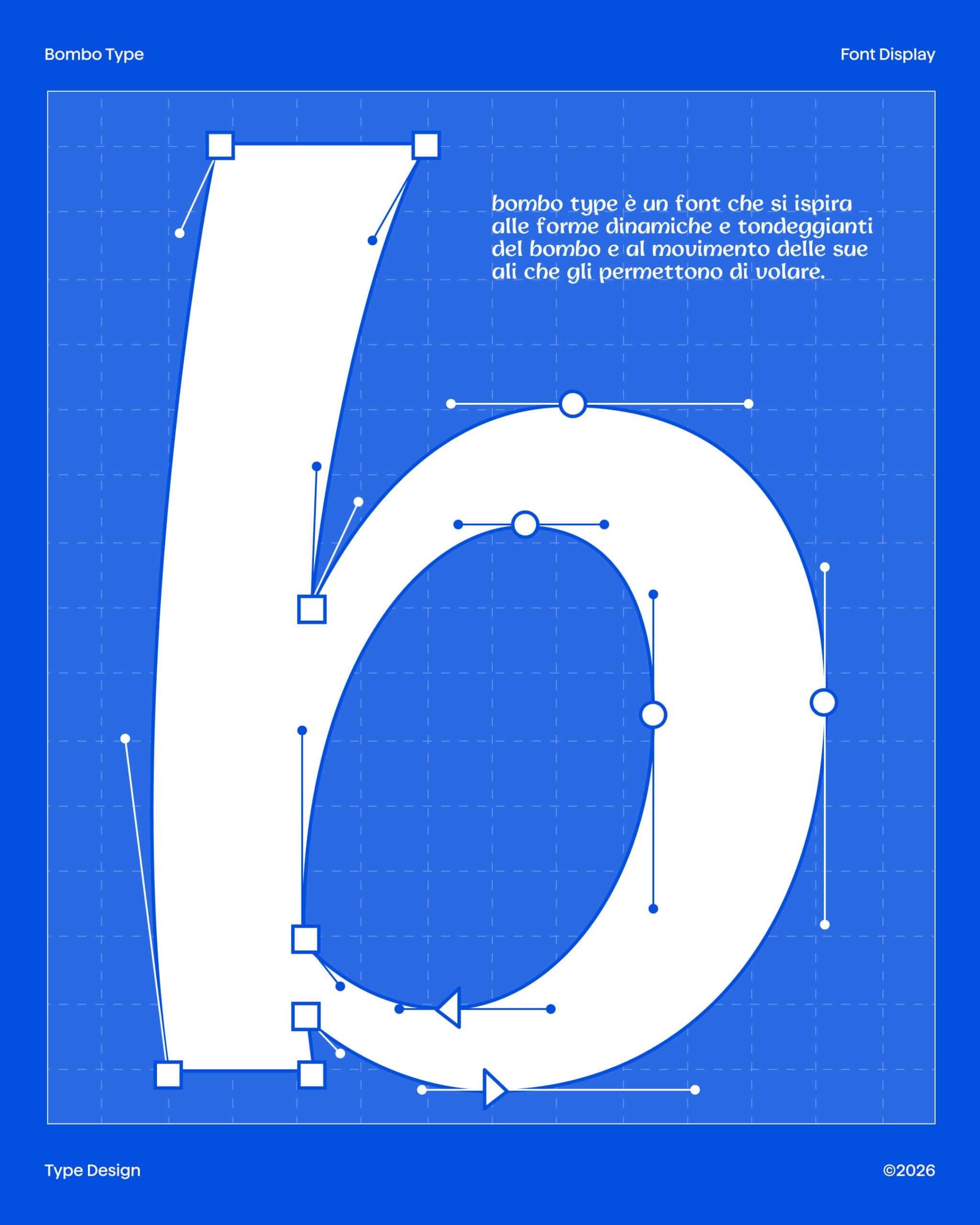
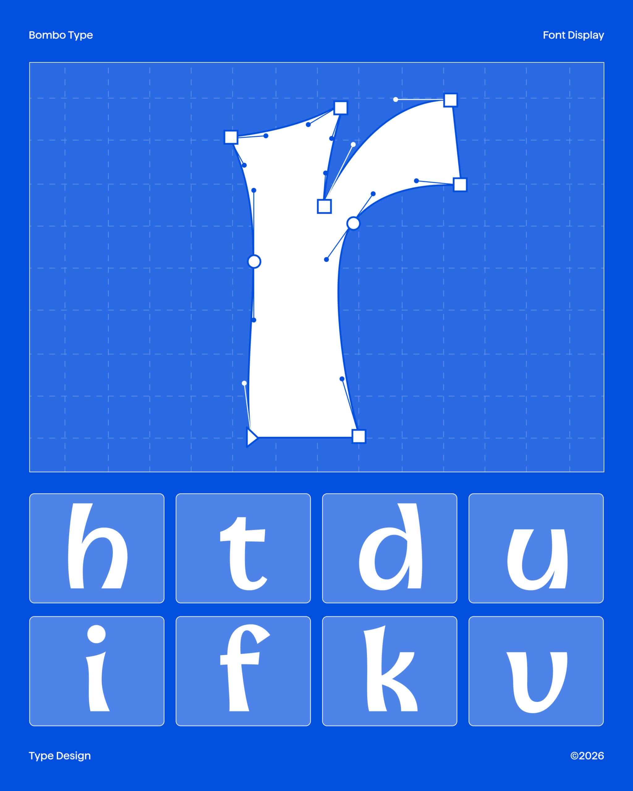
Bombo Type reflects Panfoli’s growing interest in typography within a practice spanning branding and visual design. After completing a master’s degree in Communication Design at Politecnico di Milano, she attended a Type Design course at CFP Bauer, where her interest in letterforms developed further. Her curiosity about visual languages and willingness to explore different graphic styles inform the project, bringing a characterful approach to display typography.