Kiss Branding: A New Identity Built Around the Power of Attraction
After nearly a decade of creating identities for other businesses, KISS Branding has turned its creative expertise inward, unveiling a distinctive new visual identity that reflects the studio’s evolution from a regional agency into a globally minded brand consultancy.
Founded in 2017 by Poonam Saini Kilb and Matt Kilb, Kiss has built its reputation on developing brands that connect emotionally with their audiences. As the studio continued to grow, its own identity needed to reflect the ambition, personality and creative approach behind its work.
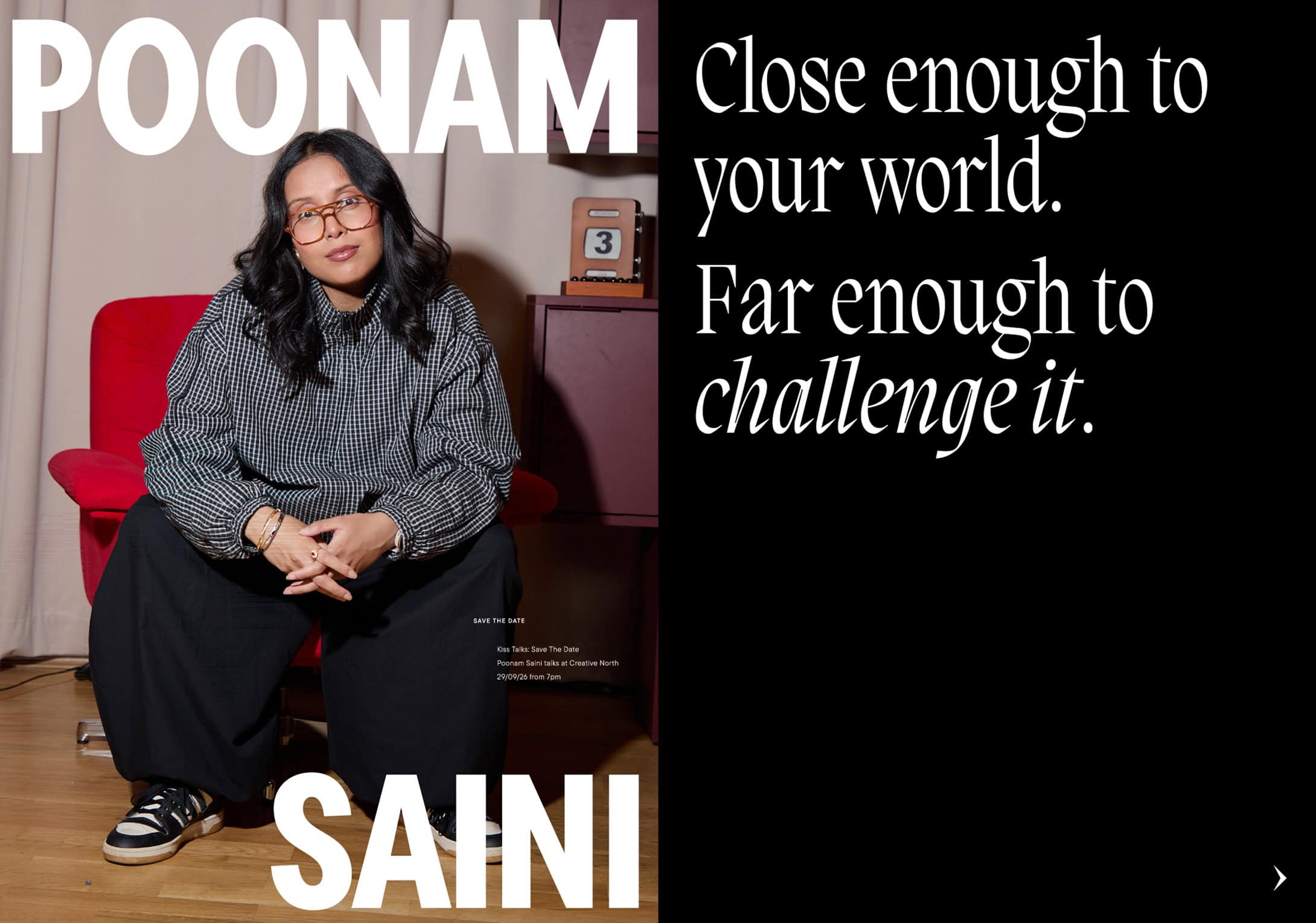
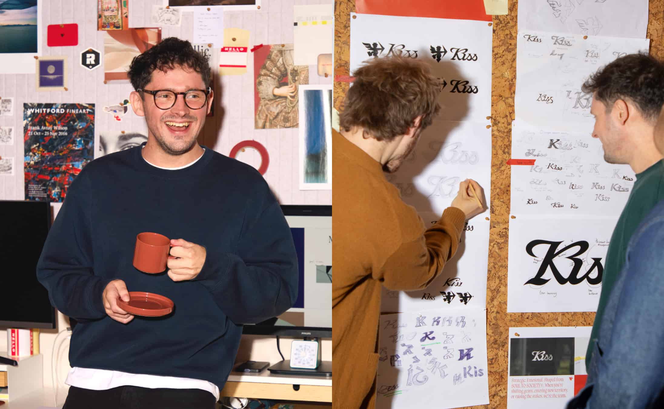
The rebranding began with a strategic direction established by the founders, who then handed the creative process over to their six-person team. Inspired by the lover archetype, the new identity introduces the concept of “Brands that Kiss”, exploring the instant attraction that can emerge between a brand and its audience.
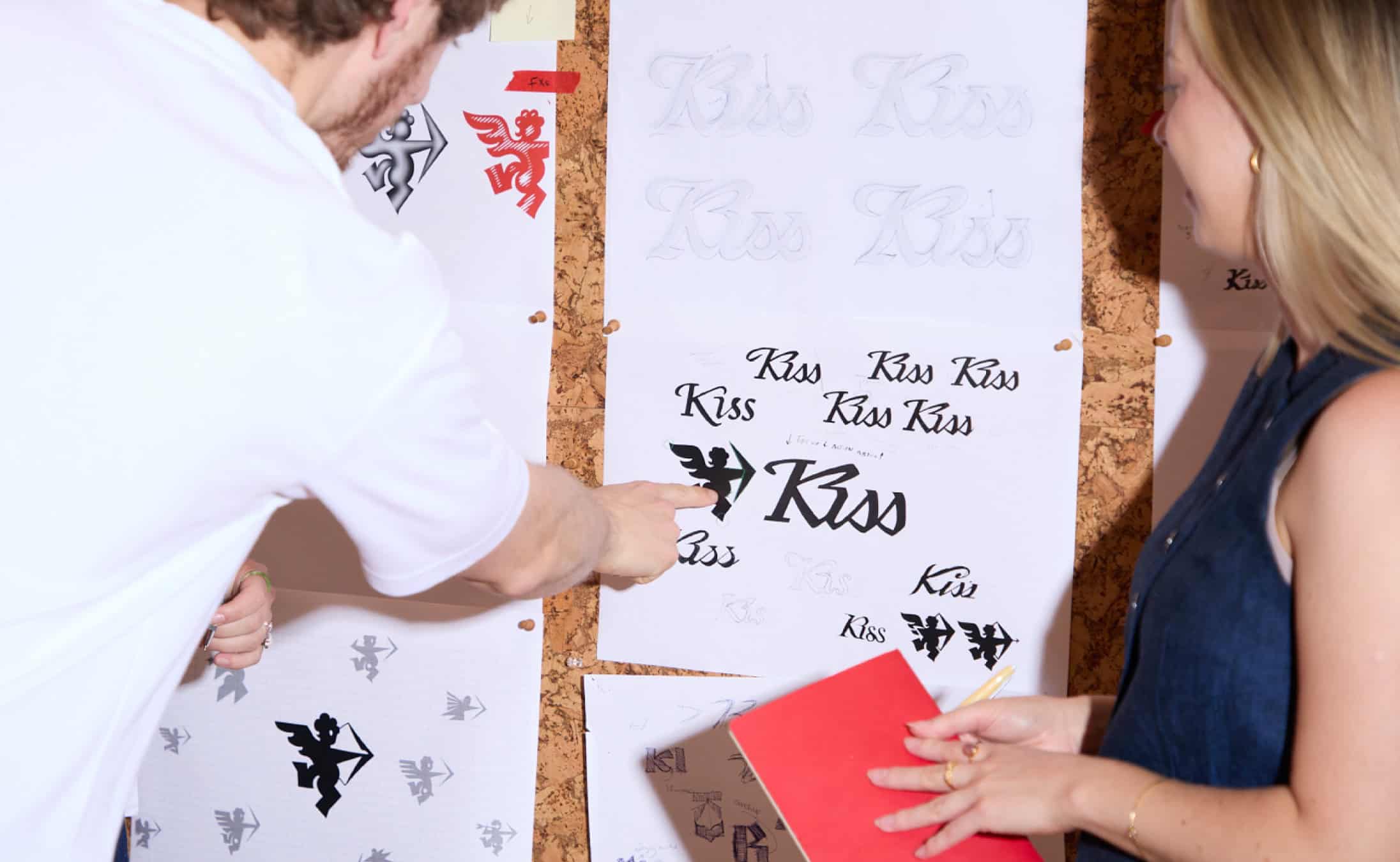
Central to the visual language is Roger Bowman, a playful Cupid mascot developed by designer Alex Lancastle through more than 100 hand-drawn iterations. Constructed from simple geometric shapes, the character combines sharp angles with expressive curves, creating a memorable personality that feels both contemporary and nostalgic. Animator Marco Palmieri brings Roger to life through hand-drawn motion, adding an additional layer of humour, warmth and spontaneity to the identity.
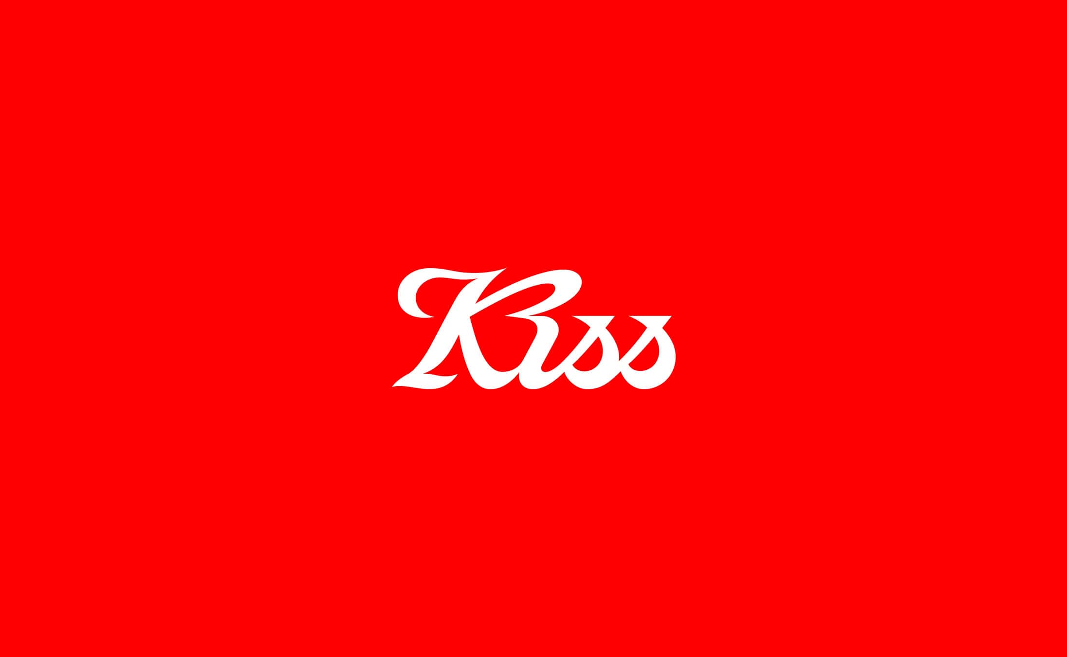
Complementing the mascot is a bespoke script wordmark created by Design Director Alex Phipps. Its flowing letterforms echo the visual characteristics of Roger Bowman, while a horizontal line cuts through the typography like an arrow ready to be released. Subtle details, including the connection between the letters K and I, introduce visual references to a heart or a bow, reinforcing the identity’s romantic symbolism without compromising its graphic impact.
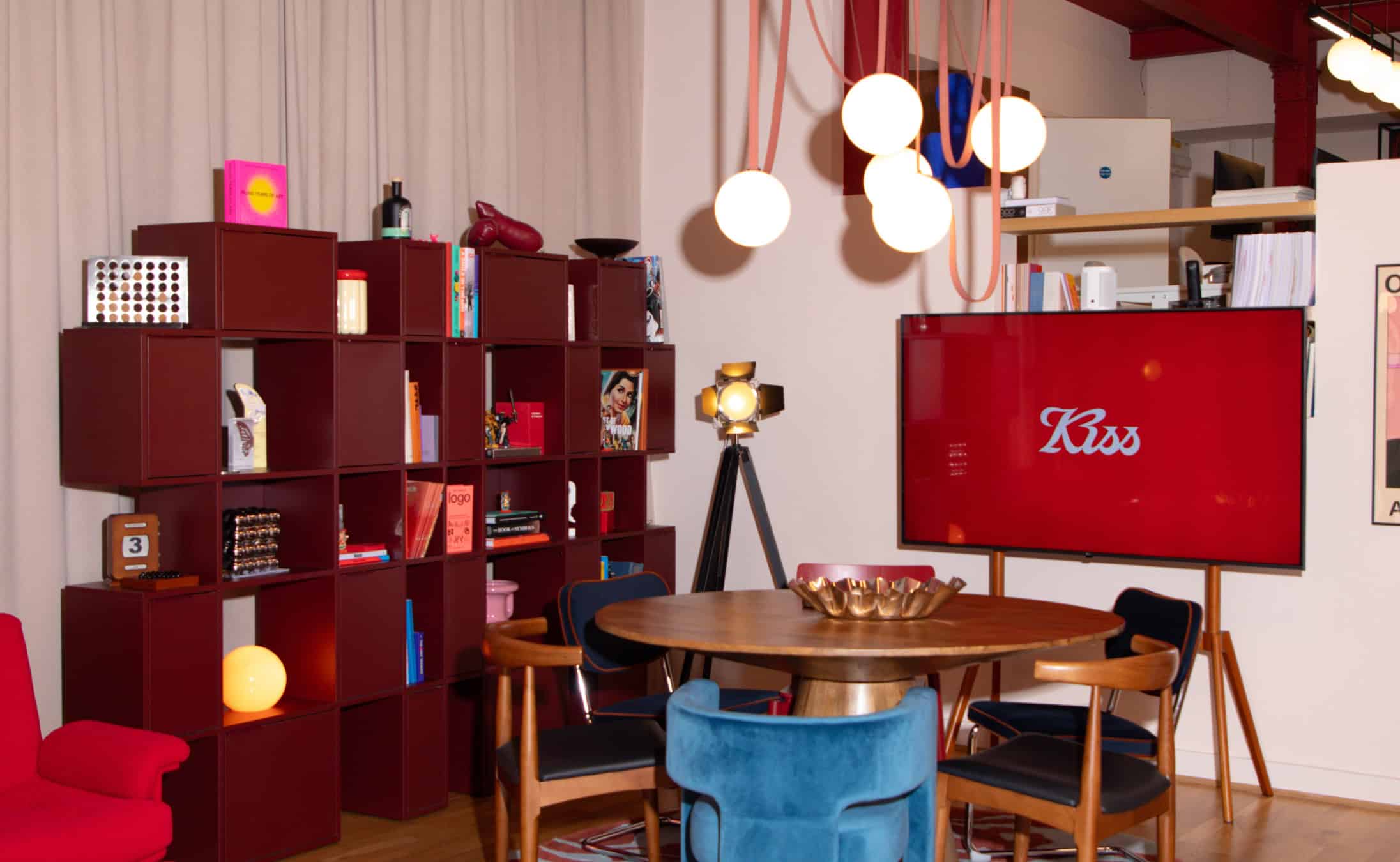
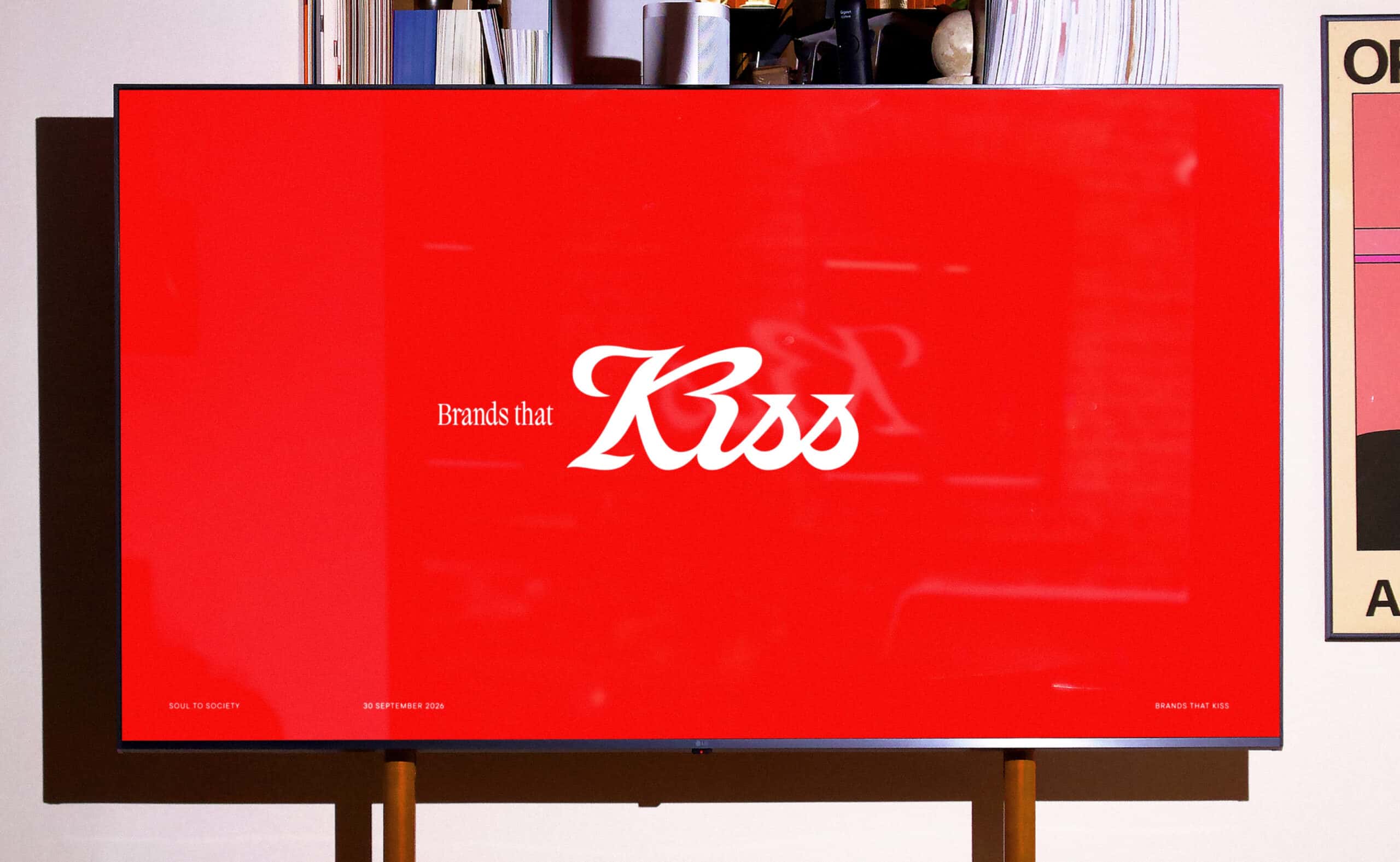
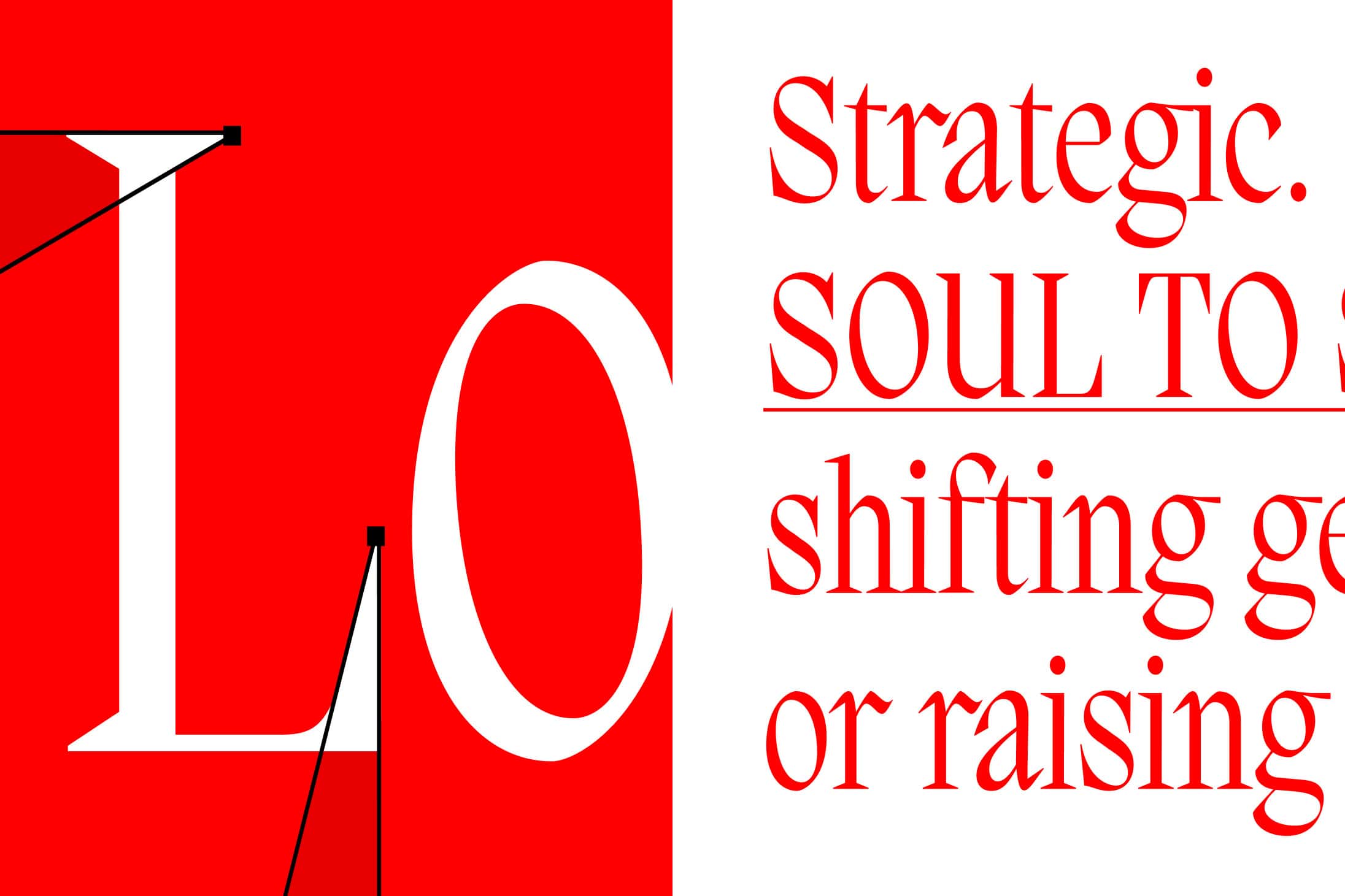
A vibrant red palette establishes a confident and instantly recognisable presence across the brand’s applications. Combined with expressive typography, character-led illustrations and animated elements, the visual system creates a cohesive yet flexible identity that balances playful storytelling with a strong graphic sensibility.
Rather than following the minimalist conventions that have come to dominate contemporary branding, Kiss embraces emotion, individuality and character. Every element contributes to a visual experience designed to capture attention and establish an immediate connection with its audience.
Working across brand strategy, naming, visual identity, packaging and implementation, KISS Branding approaches each project with a simple philosophy: “Love or die.” Its own rebranding becomes a direct expression of that belief, demonstrating how a distinctive personality and a carefully constructed visual language can transform a studio’s identity into something memorable.
With its combination of bold design, expressive animation and thoughtful symbolism, the new identity positions Kiss for its next chapter while celebrating the emotional connections that make brands worth loving.